Project Report
knitr::opts_chunk$set(echo = TRUE, message = FALSE, warning = FALSE)

library(tidyverse)
library(readxl)
library(plotly)
library(sf)
library(tmap)
library(tmaptools)
library(shinyjs)
library(ggridges)
library(patchwork)

theme_set(theme_minimal() + theme(legend.position = "right"))

options(
  ggplot2.continuous.colour = "viridis",
  ggplot2.continuous.fill = "viridis"
)

scale_colour_discrete = scale_colour_viridis_d
scale_fill_discrete = scale_fill_viridis_d
Project Name: Operation Lorax - Data Speaks for the Trees!
Project Members: Stephanie Calluori (sdc2157), Zander De Jesus (agd2159), Sharon Kulali (sjk2254), Christine Kuryla (clk2162), Grace Santos (gvs2113)
Topic
In this exploratory study, we aim to examine the geographic distribution and attributes of street trees across NYC and potential associations with sociodemographic variables and health outcomes.
Motivation
There is a growing body of evidence demonstrating the beneficial effects of green space exposure on human health (Yang et al., 2021). To better inform public health interventions, researchers are diving deeper into the specific aspects of nature, such as urban trees, and their effects on health. Most studies have observed positive effects of urban trees on physical activity and a collection of health outcomes, including respiratory, cardiovascular, and mental health ([Wolf et al.,2020] (https://www.ncbi.nlm.nih.gov/pmc/articles/PMC7345658/)). However, further exploration of health outcomes is needed. In addition, few studies have examined how urban tree exposure may differ across socio-demographic groups ([Wolf et al., 2020] (https://www.ncbi.nlm.nih.gov/pmc/articles/PMC7345658/)). Here, we focus on New York City using street tree data from 2015. In this exploratory study, we aim to examine the geographic distribution and attributes of street trees across NYC and potential associations with sociodemographic variables and health outcomes.
Significance
This research will aid in informing public health interventions to promote equitable access to urban street trees and improve health. While our analyses are retrospective, our work will lay a foundation that can be used as a comparison point when the next street tree census is released in 2025, allowing researchers to see how trends may have changed between 2015 and 2025.
Research Questions
Our project focuses on four overarching themes that center around the 2015 Street Tree Census: geographic distribution of street trees, tree attributes, access to trees across various socio-demographic groups, and tree exposure and health outcomes.
The 2015 NYC Street Tree Census includes variables referring to various geographic resolutions (e.g., zip code, nta, borough, community district) according to the 2010 Census. Originally, we suspected boroughs would be too large of a resolution to make comparisons and planned on using zip codes. However, due to the multitude of zip codes in NYC and variation in their sizes (e.g., single streets, larger areas), we thought zip codes might be too fine of a resolution. We decided to use Neighborhood Tabulation Areas (NTAs) to approximate neighborhoods, affording us a reasonable level of resolution to make comparisons as well as an action level of resolution to inform future green space based interventions. More information about NTAs can be found here: Neighborhood Boundaries Description and NTA Map of NYC. As our analyses progressed, we realized that NTAs sometimes resulted in too many geographies to compare. In addition, some qualities or outcomes of interest were only available for certain geographic resolutions. Thus, the spatial resolution of interest depended on the analysis being conducted. To supplement the 2015 data, we leaned on our shared interest in Environmental Justice efforts and the growing evidence of the health benefits of green space, to also include socio-demographic datasets to combine with the tree dataset. Since there is a current gap in the literature examining how urban tree exposures may differ across socio-demographic groups, we aim to determine if there are any racial/ethnic groups that have increased or limited opportunity to access street trees in NYC.
Finally, since we all are interested in environmental health, we aimed to examine potential effects of exposure to trees on people’s health. Based on data availability at the NTA and community district level as well as potential biological plausibility, we chose to examine asthma and heat stress related outcomes.
How are trees geographically distributed throughout New York City?
- How does tree distribution (e.g., number of trees, trees per acre) vary by borough and by neighborhood?
- What species are most/least prevalent in each borough?
- Are trees older and larger in certain areas of NYC?
- How does tree health vary by zip code across NYC and in each borough?
How does access to trees vary by socio-demographic categories by borough and neighborhoods?
- What is the population distribution of race/ethnicity in each borough?
- Does tree access vary by the race/ethnicity composition in Manhattan neighborhoods? In each borough?
- Is there an association between the percentage of people living below the poverty line and the number of trees per acre across neighborhoods in NYC? Across neighborhoods in each borough?
- Is there an association between the percentage of people who graduated high school and the number of trees per acre across neighborhoods in NYC? Across neighborhoods in each borough?
Is there a relationship between tree distribution and health outcomes related to asthma and heat stress?
- Is there an association between the number of trees per acre and the annual rate of adult emergency department visits across neighborhoods in NYC? Across neighborhoods in each borough?
- Is there an association between the number of trees per acre and the annual rate of adult asthma hospitalizations across neighborhoods in NYC? Across neighborhoods in each borough?
- Is there a spatial association between heat stress hospitalization, and the distribution of trees?
- Is there a spatial association between the ambient concentration of PM 2.5 pollution, and the distribution of trees? How do these spatial patterns look in comparison to our asthma results?
How are different tree attributes, quality, and health related to each other, and does this differ by borough?
- Are there associations between tree attributes such as wires, lights, trunk problems, and root problems?
- What is the distribution of the quality of tree surroundings and the tree attributes throughout NYC and throughout each borough?
- What is the relationship between tree health and curb placement, quality of the surrounding sidewalk, or presence of a guard (and whether the guard is helpful or unhelpful)?
Data Sources and Cleaning
Large data folder - Houses datasets larger than 200 MB. This folder was placed in the gitignore.
2015 Street Tree Census
trees_2015 =
  read_csv("large_tree_data/2015_tree_raw.csv", na = c("", "NA", "Unknown")) |>
  janitor::clean_names() |>
  mutate(spc_common = str_to_title(spc_common)) |>
mutate(health = fct_relevel(health, c("Good", "Fair", "Poor")))- Exported csv from NYC Open Data
- The street tree dataset is a part of the TreesCount! 2015 Street Tree Census organized by the NYC Parks & Recreation department and partner organizations. The census seems to be run every 10 years. Volunteers and staff collected data for each street tree. Only trees located on streets were counted; parks were not included (e.g., trees in Central Park were not counted). Each street tree was given a unique identifier.
- Geographic codes followed 2010 census designations.
- This was a very large dataset with 684,000 rows and 45 columns with each row representing a street tree. Thus, we recoded missing values as NA and removed unneeded variables as necessary.
- Variables include:
tree_id,block_id,tree_status(alive, standing dead, stump),spc_common(species name),borough,nta(nta code),nta_name,latitude,longitude, and many more! - All street trees or only alive street trees were included, depending on the analysis.
Neighborhood Poverty
poverty_raw <-
  read_csv("large_tree_data/NYC EH Data Portal - Neighborhood poverty.csv") |>
  janitor::clean_names()

poverty_clean <- poverty_raw |>
  rename(nta_name = geography, poverty_percent = percent) |>
  filter(geo_type == "NTA2010" & time == "2013-17") |>
select(nta_name, poverty_percent)- Downloaded the full table from the NYC Environment and Health Data Portal
- Filtered to include only percent data from 2013-2017 for each NTA (NTA follows census 2010 designation).
- Describes estimated percentage of people whose annual income falls below 100% of the federal poverty level in each NTA
- Estimates derived from the American Community Survey
Graduated High School
education_raw <-
  read_csv("large_tree_data/NYC EH Data Portal - Graduated high school.csv") |>
  janitor::clean_names()

education_clean <- education_raw |>
  rename(nta_name = geography, graduated_hs_percent = percent) |>
  filter(geo_type == "NTA2010" & time == "2013-17") |>
select(nta_name, graduated_hs_percent)- Downloaded the full table from the NYC Environment and Health Data Portal
- Filtered to include only percent data from 2013-2017 for each NTA (NTA follows census 2010 designation).
- Describes estimated percentage of people (25+ y/o) who completed
high school or high school equivalency in each NTA
- Estimates derived from the American Community Survey
Small data folder - Houses datasets that are under 200 MB.
Asthma Emergency Department Visits (Adults), by NTA
asthma_ed_adults_raw =
  read_csv("small_data/NYC EH Data Portal_Asthma emergency department visits adults.csv") |>
  janitor::clean_names()

asthma_ed_adults_clean = asthma_ed_adults_raw |>
  rename(nta_name = geography) |>
  filter(geo_type == "NTA2010" & time == "2017-2019") |>
select(nta_name, average_annual_age_adjusted_rate_per_10_000, average_annual_rate_per_10_000)- Downloaded the full table from the NYC Environment and Health Data Portal
- Filtered to include only average annual rate data from 2017-2019 for each NTA (NTA follows census 2010 designation). Data for 2015 was unavailable.
- Describes the average annual number of asthma-related emergency
department visits among NYC adults (18+ yrs), divided by the average
adult population (18+ yrs) using NYC DOHMH intercensal estimates for
each NTA. Expressed as cases per 10,000 residents.
- Averages derived from New York State Statewide Planning and Research Cooperative System (SPARCS) Deidentified Hospital Discharge Data
Asthma Hospitalizations (Adults), by NTA
asthma_hosp_adult_raw <-
  read_csv("small_data/NYC EH Data Portal - Asthma hospitalizations adults.csv") |>
  janitor::clean_names()

asthma_hosp_adult_clean <- asthma_hosp_adult_raw |>
  rename(nta_name = geography) |>
  filter(geo_type == "NTA2010" & time == "2012-2014") |>
select(nta_name, average_annual_age_adjusted_rate_per_10_000, average_annual_rate_per_10_000)- Downloaded the full table from the NYC Environment and Health Data Portal
- Filtered to include only average annual rate data from 2012-2014 for each NTA (NTA follows census 2010 designation). Data was only available for 2012-2014.
- Describes the average annual number of asthma-related
hospitalizations among NYC adults (18+ yrs), divided by the adult
population (18+ yrs) using NYC DOHMH intercensal estimates for each NTA.
Expressed as cases per 10,000 residents. An emergency department visit
is included if it has an ICD-9 principal diagnosis code of 493 or an
ICD-10 principal diagnosis code of J45.
- Averages derived from New York State Statewide Planning and Research Cooperative System (SPARCS) Deidentified Hospital Discharge Data
2010 US Census Data: Population Demographics
pop_race_2010 = readxl::read_excel("small_data/pop_race2010_nta.xlsx", skip = 6, col_names = FALSE, na = "NA") |>
  rename(
   "borough" = "...1" ,
   "census_FIPS" = "...2",
   "nta" = "...3",
   "nta_name" = "...4",
   "total_population" = "...5",
   "white_nonhis" = "...6",
   "black_nonhis" = "...7",
   "am_ind_alaska_nonhis" = "...8",
   "asian_nonhis" = "...9",
   "hawaii_pac_isl_nonhis" = "...10",
   "other_nonhis" = "...11",
   "two_races" = "...12",
   "hispanic_any_race" = "...13"
  ) |>
drop_na()- Accessed dataset from nyc.gov. Downloaded the xlsx file for NTAs from the tab “Race/Hispanic Origin by Age and Sex: Total Population, Under 18 and 18+ by Race/Hispanic Origin, 2010.”
- Describes total population for each NTA by race and Hispanic origin
- Cleaning process: Recoded all variable names, dropped all missing/NA entries, eventually left joined with street tree data set
2010 US Census Data: Total Acreage for each NTA
acres_raw <-
  read_excel("small_data/t_pl_p5_nta.xlsx",
             range = "A9:J203",
             col_names = c("borough", "county_code", "nta", "nta_name",
                           "total_pop_2000", "total_pop_2010", "pop_change_num",
                           "pop_change_per", "total_acres", "persons_per_acre")
             ) |>
  janitor::clean_names()

acres_sub <- acres_raw |>
  select(nta_name, total_acres, nta)

trees_per_nta <- trees_2015 |>
  select(nta_name, nta, borough, status) |>
  filter(status == "Alive") |>
  count(nta_name, borough) |>
  rename(num_trees = n)

trees_and_acres <- left_join(trees_per_nta, acres_sub, by = "nta_name")

num_missing_nta <- sum(is.na(trees_and_acres$total_acres))

trees_per_acre_df <- trees_and_acres |>
  filter(!is.na(total_acres)) |>
  mutate(trees_per_acre = num_trees/total_acres) |>
arrange(desc(trees_per_acre))- Accessed dataset from nyc.gov. Downloaded the xlsx file for NTAs from the tab “Total population, Population Change, and Density: Total Population and Persons Per Acre, 2000-2010.”
- Recoded the column names then selected nta_name and total_acres
- Describes total acreage for each NTA from 2010
Heat stress
nyc_heatstress_2015 = read_csv("small_data/nyc_Heatstress Hospitalizations_2011-2015.csv", na = c(" ", "NA", "***")) |>
  janitor::clean_names() |>
  filter(geo_type_desc == "Community District") |>
  mutate(
    average_annual_age_adjusted_rate_per_100_000 =
      str_replace(average_annual_age_adjusted_rate_per_100_000, "[*]$", "")) |>
  select(geo_id, avg_heat_hospit = average_annual_age_adjusted_rate_per_100_000, heat_hospitalizations = total) |>
mutate(avg_heat_hospit = as.numeric(avg_heat_hospit))- Accessed dataset from nyc.gov. NYC Annual Age Adj. Heat Stress Hospitalization Rate calculated from anonymized hospital records from 2011-2015. This was aggregated on the Community District resolution and joined to the NYC Community District Shapefile by Community District Code.
PM2.5
nyc_finepm2015 = read_csv("small_data/nyc_pm2.5_annual2015.csv") |>
  janitor::clean_names() |>
  filter(time == "Annual Average 2015" & geo_type_desc == "Community District") |>
select(geo_id, geography, avg_pm2.5 = mean_mcg_m3)- Accessed dataset from nyc.gov. Annual Average PM2.5 Concentrations for 2015, by NYC Community District. The NY Environmental Health Data Tracker Air Quality Database had compiled seasonal and annual averages for fine particulate matter and other criteria air pollutants as part of the New York Air Quality Community Survey. Units are in micrograms per cubic meter.
- Filtered to only look at the Community District Resolution for 2015, and then joined to the NYC Community District Shapefile by Community District Code.
Shapefiles for Spatial Mapping
- Neighborhood Tabulation Area (NTA): An NTA is a New York City neighborhood that combines several census tracts, and together, NTAs nest into Public Use Microdata Districts (PUMA). This was the lowest resolution that we aggregated both tree data and supplementary health and supplemental data for analysis. Shapefile was found on NYC Open Data based on 2010 Census, and first provided for public use by the NYC Department of Planning in 2013.
- Community District: NYC Community Districts are local political boundaries in New York City that are serviced by an elected residential community board. They have highly similar borders to NYC PUMAs, but have minor geographic alterations that differentiate them from base census tract borders of PUMAs. This was the middle ground resolution for analyzing data trends beneath borough and above NTA and MODZCTA. Shapefile was found on NYC Open Data based on 2010 Census, and first provided for public use by the NYC Department of Planning in 2013.
- MODZCTA (zip code mapping): Zip Codes are a type of postal code used within the United States to help the United States Postal Service route mail more efficiently. To represent the area that the route is in, the US Census Bureau developed ZIP Code Tabulation Areas (ZCTAs). ZCTAs with small populations are combined to create modified ZCTA (MODZCTA) which are used to specifically analyze health data. The MODZCTA shapefile used in this analysis was obtain from a geographic information system course. Although this type of shapefile can be found on NYC Open Data.
Exploratory data analysis
pop_race_2010s =
  pop_race_2010 |>
  select(- borough, -nta_name)

all_data = left_join(trees_2015, pop_race_2010s, by = "nta")

number_tree =
  all_data |>
  group_by(borough) |>
  summarize(n_trees = n_distinct(tree_id)) |>
  mutate(borough = fct_reorder(borough, n_trees))

ggplot(data = number_tree, aes(x = borough, y = n_trees, fill = borough)) + geom_bar(stat = 'identity') + geom_text(aes(label = n_trees), size = 3, vjust = -1) +
  labs(
    title = "Number of Trees in each Borough",
    x = "Borough",
    y = "Total Number of Trees"
  )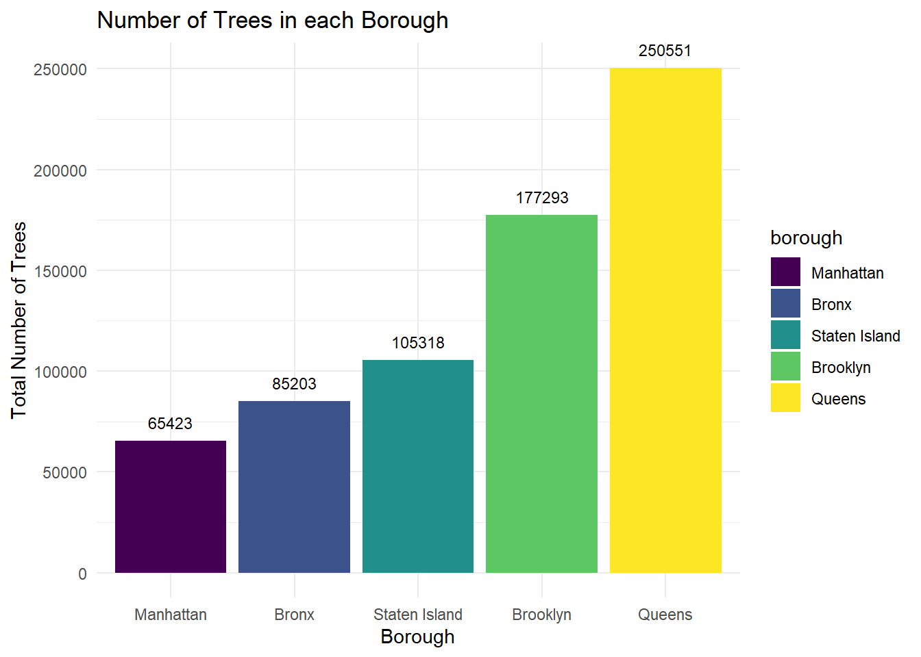
When the 2015 Tree Census data for all boroughs is compared, Queens has the largest total number of trees and Manhattan has the least.
top_trees_nyc <- trees_2015 %>%
  drop_na(spc_common) %>%
  group_by(spc_common) %>%
  count(spc_common) %>%
  arrange(desc(n)) %>%
  head(n = 10) %>%
  pull(spc_common)

 trees_2015 %>%
    drop_na(spc_common, borough) %>%
    group_by(spc_common, borough) %>%
    count(spc_common) %>%
    filter(spc_common %in% top_trees_nyc) %>%
    pivot_wider(names_from = borough, values_from = n) %>%
    mutate(`All Boroughs Average` = mean(Bronx:`Staten Island`)) %>%
    select(spc_common, `All Boroughs Average`, everything()) %>%
    pivot_longer(cols = `All Boroughs Average`:`Staten Island`) %>%
    ggplot(aes(x = reorder(spc_common, value), y = value, fill = spc_common)) +
    geom_bar(stat = "identity") +
    facet_wrap(~ name) +
    theme(axis.text.x = element_text(angle = 45, hjust = 1)) +
    labs(x = "Tree Species",
         y = "Number of Trees",
         fill = "Tree Species",
         title = "Top Ten Trees Overall and in Each NYC Borough")
This side-by-side bar chart reveals that the top 10 species vary greatly by borough. Staten Island shows the closest resemblance to the all borough average and Queens has the highest number of each top 10 species, except for the London Planetree.
trees_2015 %>%
  drop_na() %>%
  group_by(borough, spc_common) %>%
  count() %>%
  arrange(borough, desc(n)) %>%
  group_by(borough) %>%
  slice_max(n = 10, order_by = n) %>%
  select(-n) %>%
  group_by(borough) %>%
  mutate(row_num = row_number()) %>%
  pivot_wider(names_from = borough, values_from = spc_common) %>%
  unnest(cols = c(Bronx, Brooklyn, Manhattan, Queens, `Staten Island`)) %>%
  select(row_num, everything()) %>%
knitr::kable(caption = "Top 10 Tree Species in Each Borough")| row_num | Bronx | Brooklyn | Manhattan | Queens | Staten Island |
|---|---|---|---|---|---|
| 1 | Honeylocust | London Planetree | Honeylocust | London Planetree | Callery Pear |
| 2 | London Planetree | Honeylocust | Callery Pear | Pin Oak | London Planetree |
| 3 | Pin Oak | Pin Oak | Ginkgo | Honeylocust | Red Maple |
| 4 | Callery Pear | Japanese Zelkova | Pin Oak | Norway Maple | Pin Oak |
| 5 | Japanese Zelkova | Callery Pear | Sophora | Callery Pear | Cherry |
| 6 | Cherry | Littleleaf Linden | London Planetree | Cherry | Sweetgum |
| 7 | Littleleaf Linden | Norway Maple | Japanese Zelkova | Littleleaf Linden | Honeylocust |
| 8 | Norway Maple | Sophora | Littleleaf Linden | Japanese Zelkova | Norway Maple |
| 9 | Ginkgo | Cherry | American Elm | Green Ash | Silver Maple |
| 10 | Sophora | Ginkgo | American Linden | Silver Maple | Maple |
This table allows for comparison of which species are most common throughout New York City. Interestingly, there is no species that is included within the top 3 species across all boroughs.
trees_dbh = trees_2015 |>
  drop_na(tree_dbh) |>
  group_by(borough, nta_name) |>
  summarize(
    n_trees = n(),
    avg_dbh = mean(tree_dbh)) |>
  arrange(desc(avg_dbh))

trees_dbh |>
  ungroup() |>
  filter(n_trees > 100) |>
  filter(min_rank(desc(avg_dbh)) < 11) |>
knitr::kable(digits = 2, caption= "Top 10 Neighborhoods with the Highest Average DBH (inches) Across Local Street Trees")| borough | nta_name | n_trees | avg_dbh |
|---|---|---|---|
| Queens | Kew Gardens | 2024 | 15.56 |
| Queens | Woodhaven | 4254 | 15.41 |
| Brooklyn | Flatlands | 5589 | 15.40 |
| Staten Island | New Dorp-Midland Beach | 5452 | 15.24 |
| Brooklyn | East Flatbush-Farragut | 3008 | 15.01 |
| Brooklyn | Georgetown-Marine Park-Bergen Beach-Mill Basin | 7442 | 15.01 |
| Queens | South Ozone Park | 7321 | 14.97 |
| Queens | Jamaica Estates-Holliswood | 4254 | 14.73 |
| Queens | Oakland Gardens | 6059 | 14.73 |
| Queens | Auburndale | 5332 | 14.59 |
This table reveals that Queens has 6 neighborhoods within the top 10 for average DBH.
borough_dbh = trees_2015 |>
  drop_na(tree_dbh) |>
  group_by(borough) |>
  mutate(borough_dbh = mean(tree_dbh))

borough_dbh |>
  filter(tree_dbh < 101) |>
  plot_ly(y = ~tree_dbh, color = ~borough, type = "box", colors = "viridis") |>
  layout(title = "Distribution of DBH in Each Borough",
         xaxis = list(title = 'Borough'),
         yaxis = list(title = 'Measured DBH (inches)'),
        showlegend = FALSE)
The boxplots shown here all have a 25% quartile around 5 inches, but vary in 75% quartile. Manhattan had both the smallest difference between 25% and 75% quartile bounds and the smallest range of confidence intervals. The largest outliers belong to the Bronx.
borough_dbh |>
  filter(tree_dbh < 50) |>
  ggplot(aes(x = tree_dbh, fill = borough)) +
  geom_density() + facet_grid(borough ~ .) +
  scale_x_continuous(breaks = scales::pretty_breaks(12)) +
  labs(
    title = "Density Plot of All Measured Tree Diameters Below 50 inches",
    x = "Measured DBH (Inches)",
    y = "Density"
  )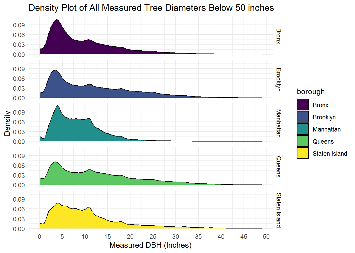
This density plot shows the spread of adult tree age in each borough, while eliminating some outliers shown in the previous box plot. The wider the right tail extends, the greater the number of older trees that exist in that borough, so this plot shows that Queens has the greatest number of older trees out of all boroughs.
dem_race =
  pop_race_2010 |>
  group_by(borough) |>
  summarize(white = sum(white_nonhis),
            black = sum(black_nonhis),
            asian = sum(asian_nonhis),
            am_ind_alaska = sum(am_ind_alaska_nonhis),
            hawaii_pac_island = sum(hawaii_pac_isl_nonhis),
            other = sum(other_nonhis),
            hispanic_all_races = sum(hispanic_any_race),
            two_races = sum(two_races)
            ) |>
  pivot_longer(
    white:two_races,
    names_to = "race",
    values_to = "n"
  ) |>
   mutate(borough = fct_reorder(borough, n))

ggplot(data = dem_race, aes(x = borough, y = n, fill = race)) + geom_bar(stat = 'identity', position = 'dodge')  +
  labs(
    title = "Population of Borough by Race",
    x = "Borough",
    y = "Total Population"
  )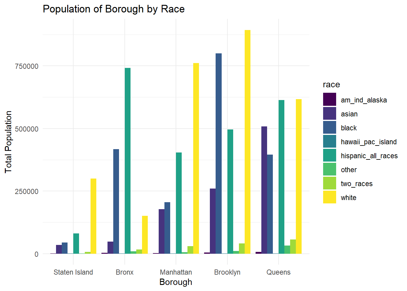
From these side-by-side bar charts, it can be concluded that the majority racial/ethnic group is White for all boroughs except for the Bronx, where Hispanic (all races) is the majority.
borough_data =
  all_data |>
  group_by(borough) |>
  summarize(n_trees = n_distinct(tree_id),
            n_white = (sum(white_nonhis)/sum(total_population)*100),
            n_black = (sum(black_nonhis)/sum(total_population)*100),
            n_asian = (sum(asian_nonhis)/sum(total_population)*100),
            n_pacific_islander = (sum(hawaii_pac_isl_nonhis)/sum(total_population)*100),
            n_amer_ind = (sum(am_ind_alaska_nonhis)/sum(total_population)*100),
            n_other = (sum(other_nonhis)/sum(total_population)*100),
            n_hispanic = (sum(hispanic_any_race)/sum(total_population)*100),
            n_two_races = (sum(two_races)/sum(total_population)*100)
            ) |>
  mutate(n_trees = as.numeric(n_trees)) |>
  arrange(desc(n_trees))

borough_data |>
knitr::kable(digits = 3, caption = "Trees and Population Demographics by Borough")| borough | n_trees | n_white | n_black | n_asian | n_pacific_islander | n_amer_ind | n_other | n_hispanic | n_two_races |
|---|---|---|---|---|---|---|---|---|---|
| Queens | 250551 | 29.840 | 17.494 | 22.617 | 0.051 | 0.303 | 1.601 | 25.424 | 2.670 |
| Brooklyn | 177293 | 34.912 | 33.732 | 9.614 | 0.025 | 0.187 | 0.439 | 19.488 | 1.603 |
| Staten Island | 105318 | 71.685 | 6.017 | 6.866 | 0.030 | 0.122 | 0.190 | 13.858 | 1.233 |
| Bronx | 85203 | 12.830 | 30.513 | 3.339 | 0.029 | 0.256 | 0.643 | 51.208 | 1.184 |
| Manhattan | 65423 | 50.743 | 13.488 | 9.241 | 0.032 | 0.132 | 0.327 | 24.153 | 1.885 |
The table above includes summary statistics on the total number of trees, along with the percentage of the population belonging to each racial/ethnic group in each borough. Despite Queens having the most number of trees, it has the least skewed population demographics out of all boroughs. Staten Island has the highest percentage of white residents, with more than 20% more than the next highest percentage in Manhattan.
tree_status_df <- trees_2015 %>%
  select(curb_loc, guards, sidewalk, health, status,
         borough,
         root_stone, root_grate, root_other,
         trunk_wire, trnk_light, trnk_other,
         brch_light, brch_shoe, brch_other) %>%
  mutate(health = fct_relevel(health, c("Good", "Fair", "Poor")),
         borough = as.factor(borough),
         All = as.factor("All"),
         curb_loc = case_match(curb_loc,
                               "OffsetFromCurb" ~ "Offset From Curb",
                               "OnCurb" ~ "On Curb"),
         curb_loc = as.factor(curb_loc),
         guards = as.factor(guards),
         sidewalk = case_match(sidewalk,
                               "NoDamage" ~ "No Damage",
                               "Damage" ~ "Damage"),
         sidewalk = as.factor(sidewalk),
         status = as.factor(status)
         ) %>%
  rename(`Curb Location` = curb_loc,
         `All of NYC` = All,
         Borough = borough,
         Guards = guards,
         Sidewalk = sidewalk,
         `Alive, Dead, or Stump` = status,
         Health = health,
         `Roots with Stones` = root_stone,
         `Roots in Grate` = root_grate,
         `Root Problem (Other)` = root_other,
         `Trunk has Wires` = trunk_wire,
         `Trunk has Lights` = trnk_light,
         `Trunk has Other Problem` = trnk_other,
         `Branches have Lights` = brch_light,
         `Branches with Shoes` = brch_shoe,
         `Branches Problem (Other)` = brch_other) %>%
  select(Borough, `All of NYC`, everything())

exposure_options <- colnames(tree_status_df)[3:length(tree_status_df)]
outcome_options <- colnames(tree_status_df)[3:length(tree_status_df)]


# Define function

effective_tree_protection <- function(df, exposure_str, outcome_str){

  # Convert character strings to symbols
  exposure_sym <- rlang::sym(exposure_str)
  outcome_sym <- rlang::sym(outcome_str)

  # Make contingency table for the chi-square test
  contingency_table <- df %>%
    filter(!is.na(!!exposure_sym), !is.na(!!outcome_sym)) %>%
    group_by(!!outcome_sym, !!exposure_sym) %>%
    count(!!outcome_sym, !!exposure_sym) %>%
    pivot_wider(names_from = !!exposure_sym, values_from = n)

  # Perform the chi-square test
  chisq_test_result <- chisq.test(contingency_table[-1])
  chi_square <- chisq_test_result$statistic
  p_value <- chisq_test_result$p.value

  # Visualize the distribution differences
  plot_title <- str_c("Distribution of ", exposure_str,
                      " by ", outcome_str)

df %>%
    filter(!is.na(!!exposure_sym), !is.na(!!outcome_sym)) %>%
    group_by(!!exposure_sym, !!outcome_sym) %>%
    summarize(n = n(), .groups = 'drop') %>%
    group_by(!!exposure_sym) %>%
    mutate(Percent = n / sum(n) * 100) %>%
    ggplot(aes(x = !!exposure_sym, y = Percent, fill = !!outcome_sym)) +
    geom_bar(stat = 'identity', position = 'dodge') +
    geom_text(aes(label = sprintf("%.1f%%", Percent)),
              position = position_dodge(width = 0.9),
              size = 3.5,
              vjust = -0.3) +
    labs(title = plot_title,
         subtitle = sprintf("p value = %.1e (Chi-square = %.2f)", p_value, chi_square))
}

effective_tree_protection(df = tree_status_df,
                              exposure_str = "All of NYC",
                              outcome_str = "Health")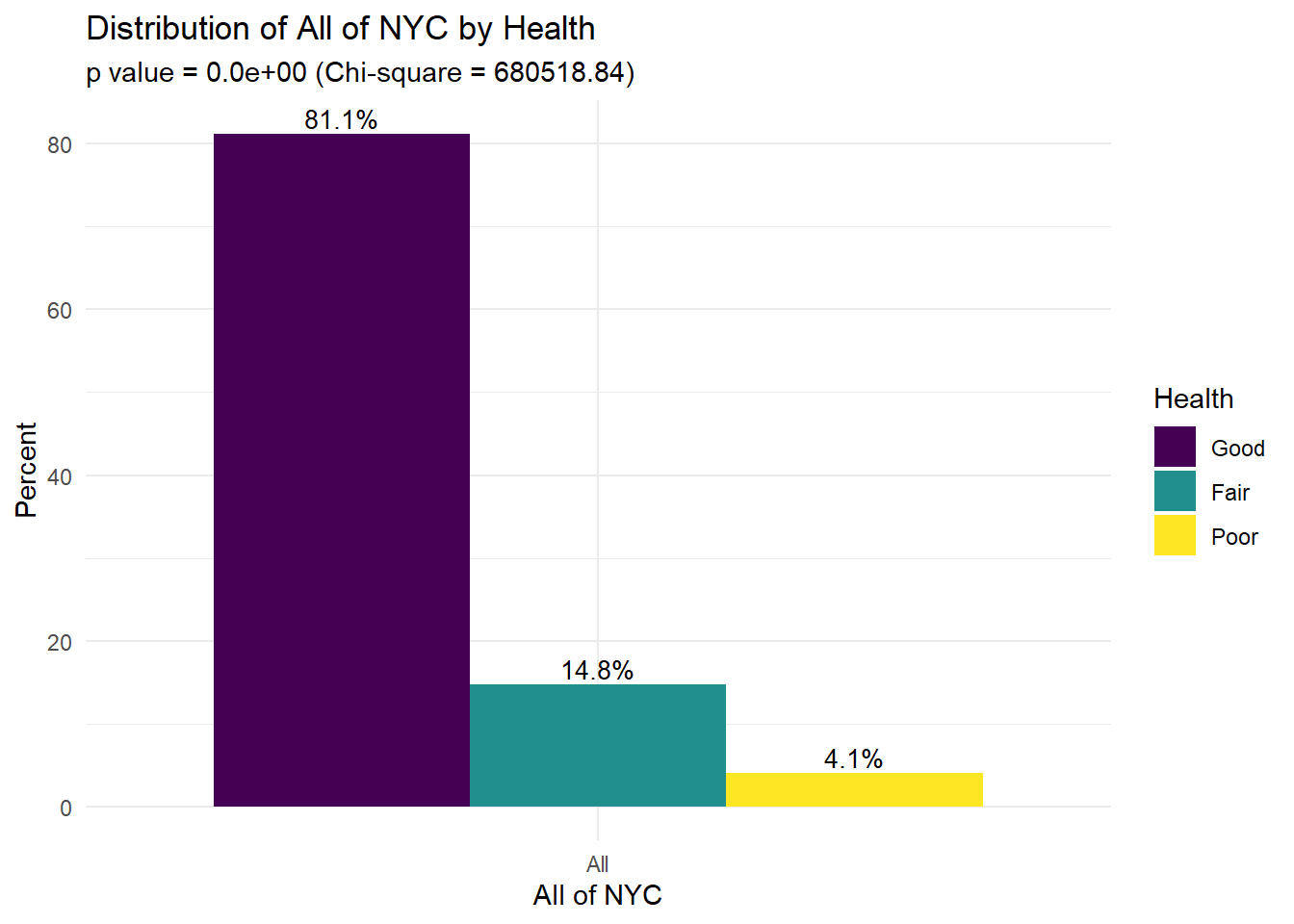
effective_tree_protection(df = tree_status_df,
                              exposure_str = "All of NYC",
                              outcome_str = "Sidewalk")
effective_tree_protection(df = tree_status_df,
                              exposure_str = "All of NYC",
                              outcome_str = "Roots with Stones")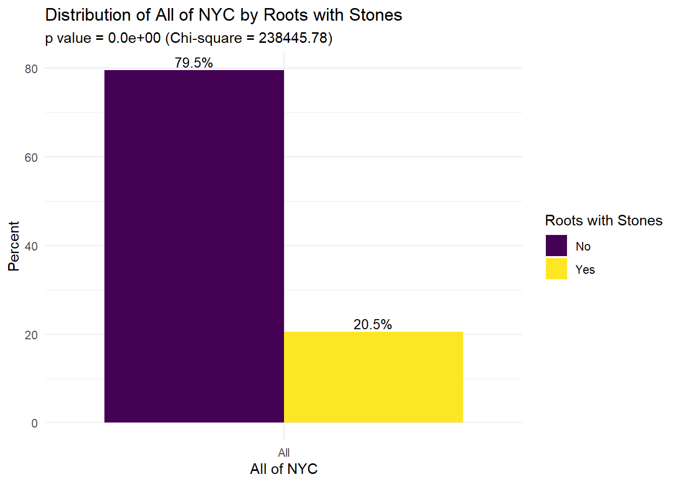
This figure shows the distribution of different attributes of trees and their status across all of NYC. For example, we see that 81.1% of trees are in “good” health, 14.8% of trees are in “fair” health, and 4.1% of trees are in “poor” health. Notably, 28.7% of sidewalks are damaged (71.2% not damaged). The majority of trees (87.8%) do not have guards and 20.5% of tree roots have stones.
    effective_tree_protection(df = tree_status_df,
                              exposure_str = "Borough",
                              outcome_str = "Health")
Compared to the other four boroughs, Manhattan had the lowest percentage of trees in “good” health, and the highest percentage of trees in both “fair” and “poor” health. Overall in NYC, 81.1% of trees were in “good” health, 14.8% of trees were in “fair” health, and 4.1% were in “poor” health.
Maps
nyc_nta = st_read("small_data/geo_export_e924b274-8b6e-427d-87c0-92bfde8ce30a.shp")## Reading layer `geo_export_e924b274-8b6e-427d-87c0-92bfde8ce30a' from data source `C:\Users\Kulal\OneDrive - Columbia University Irving Medical Center\Fall 2023\Data Science\P8105\p8105_final\small_data\geo_export_e924b274-8b6e-427d-87c0-92bfde8ce30a.shp'
## using driver `ESRI Shapefile'
## Simple feature collection with 195 features and 7 fields
## Geometry type: MULTIPOLYGON
## Dimension: XY
## Bounding box: xmin: -74.25559 ymin: 40.49612 xmax: -73.70001 ymax: 40.91553
## Geodetic CRS: WGS84(DD)nta_dbh_summarized = trees_2015 |>
drop_na(tree_dbh) |>
group_by(nta) |>
summarize(
trees_per_nta = n(),
avg_dbh = mean(tree_dbh))
nta_dbh_spatial = merge(nyc_nta, nta_dbh_summarized,
by.x = "ntacode",
by.y = "nta")
tm_shape(nta_dbh_spatial) +
tm_polygons(col = "trees_per_nta",
style = "quantile",
n = 5,
palette = "Greens",
border.col = "black",
title = "Number of Trees per NTA") +
tm_layout(main.title = "Total Tree Count Across NYC Neighborhoods", main.title.size = 1,
frame = FALSE) +
tm_legend(legend.position = c("left","center"),
legend.text.size = 0.52)
- The neighborhoods that appear to have the lowest number of street trees are lower Manhattan and the North Bronx.
- Neighborhoods with highest tree counts appear to be Southern Staten Island, Southeast Brooklyn, and across Queens.
tm_shape(nta_dbh_spatial) +
  tm_polygons(col = "avg_dbh",
              style = "quantile",
              n = 5,
              palette = "YlGn",
              border.col = "black",
              title = "Mean Tree DBH (Inches)") +
  tm_layout(main.title = "Average Tree DBH Across NYC Neighborhoods",
            main.title.size = 1,
            frame = FALSE) +
  tm_legend(legend.position = c("left","center"),
            legend.text.size = 0.52)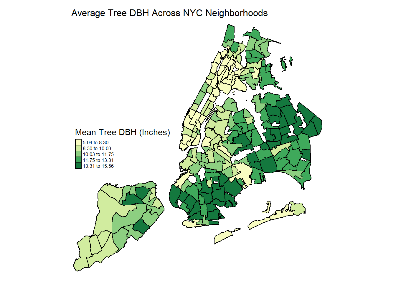
- Highest DBH clusters between 13 and 15 inches are in easternmost Queens and South Brooklyn, some of the most residential and spacious neighborhoods of the city. Suggests these neighborhoods have the largest percentage of significantly older trees that have been growing for decades.
- Lowest DBH neighborhoods across downtown Manhattan and the Bronx - youngest and smallest trees. May have more routine plantings of young trees - and also limited curb space that stunts growth.
trees_nta_map = trees_2015|>
  select(nta_name, nta, borough, status) |>
  filter(status == "Alive") |>
  count(nta, borough) |>
  rename(num_trees = n)

trees_and_acres_map = left_join(trees_nta_map, acres_sub, by = "nta")
num_missing_nta = sum(is.na(trees_and_acres$total_acres))

trees_per_acre_mapdf = trees_and_acres_map |>
  filter(!is.na(total_acres)) |>
  mutate(trees_per_acre = num_trees/total_acres) |>
  arrange(desc(trees_per_acre))

tree_acre_spatial = merge(nyc_nta, trees_per_acre_mapdf,
                        by.x = "ntacode",
                        by.y = "nta")

tm_shape(tree_acre_spatial) +
  tm_polygons(col = "trees_per_acre",
              style = "quantile",
              n = 5,
              palette = "Greens",
              border.col = "black",
              title = "Avg. Trees Per Acre by NTA") +
  tm_layout(main.title = "Tree Count Per Acre Across NYC Neighborhoods", main.title.size = 1,
            frame = FALSE) +
  tm_legend(legend.position = c("left","center"),
            legend.text.size = 0.52)
- Shows that Upper West Side, Harlem, and certain Bronx neighborhoods do have greater tree density - but this may be a greater distribution of younger trees in the same area - recent plantings?
- Larger, more concentrated neighborhood density bands of urban street trees in Brooklyn and mid-Queens: neighborhoods surrounding Flushing.
zip_nyc = st_read("small_data/MODZCTA_2010.shp")## Reading layer `MODZCTA_2010' from data source
## `C:\Users\Kulal\OneDrive - Columbia University Irving Medical Center\Fall 2023\Data Science\P8105\p8105_final\small_data\MODZCTA_2010.shp'
## using driver `ESRI Shapefile'
## Simple feature collection with 178 features and 2 fields
## Geometry type: MULTIPOLYGON
## Dimension: XY
## Bounding box: xmin: 913176 ymin: 120122 xmax: 1067382 ymax: 272844
## Projected CRS: Lambert_Conformal_Conictrees_df =
trees_2015 |>
drop_na() |>
group_by(postcode, borough, health) |>
summarize(
n_trees = n())
trees_zip =
merge(zip_nyc, trees_df,
by.x = "MODZCTA",
by.y = "postcode") |>
janitor::clean_names()
trees_zip |>
tm_shape() +
tm_polygons(col = "health",
style = "equal",
n = 3,
palette = "viridis",
border.col = "black",
title = "Tree Health Status")+
tm_layout(main.title = "Tree Heath by Zip Codes in NYC",
main.title.size = 1,
frame = FALSE) +
tm_legend(legend.position = c("left","center"),
legend.text.size = 0.52)
- This map highlights the most prevalent tree health status in each zip code.
- There is quite heterogeneous variability in assessed tree health across zip codes, and a clear spatial clustering pattern does not appear to be systematic across a particular borough or region.
trees_2015 |>
  drop_na() |>
  filter(
         nta_name %in% c("Washington Heights South", "Washington Heights North")) |>
   plot_ly(color = ~health, colors = "viridis") |>
  add_trace(
    type = "scattermapbox",
    mode = "markers",
    lon = ~longitude,
    lat = ~latitude,
    marker = list(size = 5),
    text = ~spc_common,
    below = "markers"
  ) |>
  layout(
    title = "Tree Health in Washington Heights",
    mapbox = list(
      style = "carto-positron",
      center = list(lon = -73.94, lat = 40.84),
      zoom = 12
    ),
    showlegend = T
)- This plot is an interactive scatter plot of every tree included in Washington Heights included in the 2015 Street Tree Census data set. The colors indicate the health of the tree and when hovering over a certain point, the latitude, longitude, and exact species are shown.
nyc_nta = st_read("small_data/geo_export_e924b274-8b6e-427d-87c0-92bfde8ce30a.shp")## Reading layer `geo_export_e924b274-8b6e-427d-87c0-92bfde8ce30a' from data source `C:\Users\Kulal\OneDrive - Columbia University Irving Medical Center\Fall 2023\Data Science\P8105\p8105_final\small_data\geo_export_e924b274-8b6e-427d-87c0-92bfde8ce30a.shp'
## using driver `ESRI Shapefile'
## Simple feature collection with 195 features and 7 fields
## Geometry type: MULTIPOLYGON
## Dimension: XY
## Bounding box: xmin: -74.25559 ymin: 40.49612 xmax: -73.70001 ymax: 40.91553
## Geodetic CRS: WGS84(DD)nta_asthma_spatial = merge(nyc_nta, asthma_hosp_adult_clean,
by.x = "ntaname",
by.y = "nta_name")
tm_shape(nta_asthma_spatial) +
tm_polygons(col = "average_annual_rate_per_10_000",
style = "quantile",
n = 5,
palette = "Purples",
border.col = "black",
title = "Asthma Hospitalization Rate per 10k") +
tm_layout(main.title = "Avg. Annual Hospitalization Rate Across NYC Neighborhoods", main.title.size = 1,
frame = FALSE) +
tm_legend(legend.position = c("left","center"),
legend.text.size = 0.52)
- Highest Asthma hospitalization has spatial clusters in Bronx and mid-Brooklyn. South Manhattan has the lowest hospitalization rate. Income, socioeconomic mobility, and structural healthcare access appear to be playing major roles across neighborhoods.
nyc_comdist = st_read("small_data/geo_export_bd3c92bc-94de-48f3-9de3-e939473f307b.shp")## Reading layer `geo_export_bd3c92bc-94de-48f3-9de3-e939473f307b' from data source `C:\Users\Kulal\OneDrive - Columbia University Irving Medical Center\Fall 2023\Data Science\P8105\p8105_final\small_data\geo_export_bd3c92bc-94de-48f3-9de3-e939473f307b.shp'
## using driver `ESRI Shapefile'
## Simple feature collection with 71 features and 3 fields
## Geometry type: MULTIPOLYGON
## Dimension: XY
## Bounding box: xmin: -74.25559 ymin: 40.49613 xmax: -73.70001 ymax: 40.91553
## Geodetic CRS: WGS84(DD)nyc_finepm2015 = read_csv("small_data/nyc_pm2.5_annual2015.csv") |>
janitor::clean_names() |>
filter(time == "Annual Average 2015" & geo_type_desc == "Community District") |>
select(geo_id, geography, avg_pm2.5 = mean_mcg_m3)
trees_cd_summarized = trees_2015 |>
drop_na(tree_dbh) |>
mutate(health = as.factor(health)) |>
group_by(community_board) |>
summarize(
"Number of Trees" = n(),
avg_dbh = mean(tree_dbh),
health_status = mode(health))
nyc_comdistrict_spatial = merge(nyc_comdist, trees_cd_summarized, nyc_finepm2015,
by.x = "boro_cd",
by.y = "community_board")
nyc_comdistrict_treesPM = merge(nyc_comdistrict_spatial, nyc_finepm2015,
by.x = "boro_cd",
by.y = "geo_id")
tm_shape(nyc_comdistrict_treesPM) +
tm_polygons(col = "avg_pm2.5",
style = "quantile",
n = 5,
palette = "YlOrBr",
border.col = "black",
title = "Average PM2.5 Concentration (µg/m3)") +
tm_shape(nyc_comdistrict_treesPM) +
tm_dots(col = "black",
size = "Number of Trees",
style = "quantile",
border.col = "black") +
tm_layout(main.title = "Average 2015 PM2.5 Concentrations
across NYC Community Districts", main.title.size = 1,
frame = FALSE) +
tm_legend(legend.position = c("left","top"),
legend.text.size = 0.52)
- Highest chronic pollution across Manhattan and Upper Brooklyn neighborhoods/ This map suggests that the community districts with highest fine particulate exposures also have the lowest number of trees.
- Lowest ambient PM2.5 on the outermost edges of Brooklyn and Queens, also have high tree counts and highest dbh averages.
- Despite the highest pollution in these neighborhoods, asthma hospitalization still concentrated in the predominantly BIPOC communities of Central Bronx and Brooklyn.
nyc_comdistrict_heatstress = merge(nyc_comdistrict_treesPM, nyc_heatstress_2015,
                        by.x = "boro_cd",
                        by.y = "geo_id")

tm_shape(nyc_comdistrict_heatstress) +
  tm_polygons(col = "avg_heat_hospit",
              style = "jenks",
              n = 5,
              palette = "OrRd",
              border.col = "black",
              title = "Avg. Adjusted Hospitalization Rate per 100k") +
tm_shape(nyc_comdistrict_treesPM) +
  tm_dots(col = "black",
          size = "Number of Trees",
          style = "quantile",
          border.col = "black") +
  tm_layout(main.title = "Average Heatstress Hospitalization Rate
            across NYC Community Districts", main.title.size = 1,
            frame = FALSE) +
  tm_legend(legend.position = c("left","top"),
            legend.text.size = 0.52)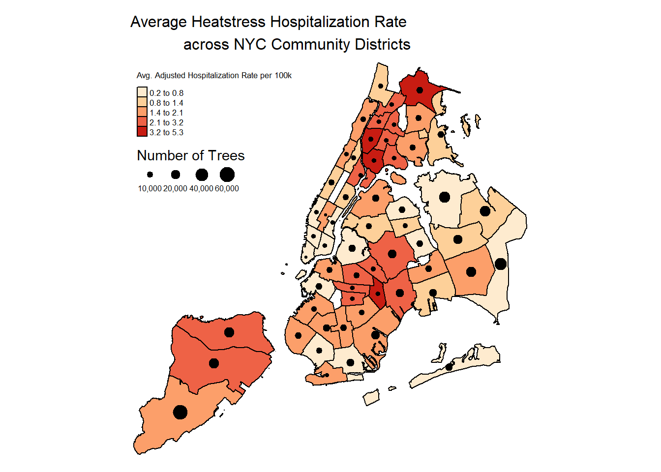
- Largest cluster of heat stress hospitalizations is in the Bronx, as well as in Brooklyn
- The relationship between heat stress events and trees is a bit more variable. High count of trees in Queens community districts does align. But the low tree counts and low hospitalization in lower Manhattan may be due to other factors that induce urban heat and improved medical / healthcare access in that area.
Statistical analysis
Method for Calculating Correlation Coefficients
Correlation coefficients were calculated to gauge if a linear association exists between our x and y variables. To test the significance of a correlation coefficient, x and y variables must have a bivariate normal distribution. Since most of our x and y variables exhibited a skewed distribution (histograms not shown), we were unable to test the significance of the correlation coefficient at this time.
Since NTAs may differ in size, trees per acre was used to standardize street tree counts in each NTA by the acreage of the NTA. 6 NTAs from the 2015 Tree Census were missing acreage information, so these NTAs were removed for these analyses.
Only alive trees were included in the poverty, education, asthma emergency department visits, and asthma hospitalizations analyses.
Poverty
trees_and_poverty <- left_join(trees_per_acre_df, poverty_clean, by = "nta_name")

trees_and_poverty |>
  plot_ly(data = _, x = ~poverty_percent, y = ~trees_per_acre,
          color = ~nta_name,
          colors = "viridis",
          type = "scatter",
          mode = "markers",
          text = ~paste("neighborhood: ", nta_name, "<br>borough: ", borough,
                        "<br>%below poverty line: ", poverty_percent,
                        "<br>trees per acre: ", trees_per_acre)) |>
    layout(title = "Percent below the poverty line and trees per acre in NYC",
           xaxis = list(title = 'Percentage of people whose income <br> is below the poverty line'),
           yaxis = list(title = 'Number of trees per acre'),
           legend = list(title=list(text='Neighborhood')))
trees_and_poverty |>
filter(borough == "Staten Island") |>
plot_ly(data = _, x = ~poverty_percent, y = ~trees_per_acre,
color = ~nta_name,
colors = "viridis",
type = "scatter",
mode = "markers",
text = ~paste("neighborhood: ", nta_name, "<br>borough: ", borough,
"<br>%below poverty line: ", poverty_percent,
"<br>trees per acre: ", trees_per_acre)) |>
layout(title = "Percent below the poverty line and trees per acre in Staten Island",
xaxis = list(title = 'Percentage of people whose income <br> is below the poverty line'),
yaxis = list(title = 'Number of trees per acre'),
legend = list(title=list(text='Neighborhood')))staten_island_trees_and_poverty <- trees_and_poverty |>
filter(borough == "Staten Island")trees_and_poverty |>
filter(borough == "Queens") |>
plot_ly(data = _, x = ~poverty_percent, y = ~trees_per_acre,
color = ~nta_name,
colors = "viridis",
type = "scatter",
mode = "markers",
text = ~paste("neighborhood: ", nta_name, "<br>borough: ", borough,
"<br>%below poverty line: ", poverty_percent,
"<br>trees per acre: ", trees_per_acre)) |>
layout(title = "Percent below the poverty line and trees per acre in Queens",
xaxis = list(title = 'Percentage of people whose income <br> is below the poverty line'),
yaxis = list(title = 'Number of trees per acre'),
legend = list(title=list(text='Neighborhood')))queens_trees_and_poverty <- trees_and_poverty |>
filter(borough == "Queens")There is an inconsistent association between the percentage of people living below the poverty line and the number of trees per acre. This indicates that additional factors may be at play and the relationship may be sensitive to locale.
- Across all neighborhoods in NYC, there is a very weak, negative, linear association between percentage of people living below the poverty line and number of trees per acre (r = - 0.0220).
- Associations differ by borough.
- Notably, neighborhoods across Staten Island (r = -0.4646) and Queens (r = -0.4384) exhibit a moderate, negative, linear association between percentage of people living below the poverty line and number of trees per acre; as the percentage of people living below the poverty line increases, the number of trees per acre decreases.
Education
trees_and_education <- left_join(trees_per_acre_df, education_clean, by = "nta_name")

trees_and_education |>
  plot_ly(data = _, x = ~graduated_hs_percent, y = ~trees_per_acre,
          color = ~nta_name,
          colors = "viridis",
          type = "scatter",
          mode = "markers",
          text = ~paste("neighborhood: ", nta_name, "<br>borough: ", borough, "<br>% graduated HS: ",
                        graduated_hs_percent, "<br>trees per acre: ", trees_per_acre)) |>
  layout(title = "Percent graduated high school and trees per acre in NYC",
         xaxis = list(title = 'Percent graduated <br> high school (includes equivalency)'),
         yaxis = list(title = 'Number of trees per acre'),
         legend = list(title=list(text='Neighborhood')))
trees_and_education |>
filter(borough == "Staten Island") |>
plot_ly(data = _, x = ~graduated_hs_percent, y = ~trees_per_acre,
color = ~nta_name,
colors = "viridis",
type = "scatter",
mode = "markers",
text = ~paste("neighborhood: ", nta_name, "<br>borough: ", borough, "<br>% graduated HS: ",
graduated_hs_percent, "<br>trees per acre: ", trees_per_acre)) |>
layout(title = "Percent graduated high school and trees per acre in Staten Island",
xaxis = list(title = 'Percent graduated <br> high school (includes equivalency)'),
yaxis = list(title = 'Number of trees per acre'),
legend = list(title=list(text='Neighborhood')))staten_island_trees_and_education <- trees_and_education |>
filter(borough == "Staten Island")There is an inconsistent association between the percentage of people who graduated high school and the number of trees per acre. This indicates that additional factors may be at play and the relationship may be sensitive to locale.
- Across all neighborhoods in NYC, there is a weak, positive, linear association between the percentage of people who graduated high school and the number of trees per acre (r = 0.0940).
- Associations differ by borough.
- Notably, neighborhoods across Staten Island (r = 0.5839) exhibit a moderate, positive, linear association between percentage of people who graduated high school and the number of trees per acre; as the percentage of people who graduated high school increases, the number of trees per acre increases.
Asthma Emergency Department Visits
trees_and_asthma_ed_adult <- left_join(trees_per_acre_df, asthma_ed_adults_clean, by = "nta_name")

trees_and_asthma_ed_adult |>
  plot_ly(data = _, x = ~trees_per_acre, y = ~average_annual_rate_per_10_000,
          color = ~nta_name,
          colors = "viridis",
          type = "scatter",
          mode = "markers",
          text = ~paste("neighborhood: ", nta_name, "<br>borough: ", borough,
                        "<br>tree per acre: ", trees_per_acre, "<br>rate of adult asthma ED visits: ",
                        average_annual_rate_per_10_000)) |>
    layout(title = "Trees per acre and rate of adult asthma ED visits in NYC",
           xaxis = list(title = 'Number of trees per acre'),
           yaxis = list(title = 'Average annual rate of <br> adult asthma emergency dept visits (per 10,000)'),
           legend = list(title=list(text='Neighborhood')))
trees_and_asthma_ed_adult |>
filter(borough == "Staten Island") |>
plot_ly(data = _, x = ~trees_per_acre, y = ~average_annual_rate_per_10_000,
color = ~nta_name,
colors = "viridis",
type = "scatter",
mode = "markers",
text = ~paste("neighborhood: ", nta_name, "<br>borough: ", borough,
"<br>tree per acre: ", trees_per_acre, "<br>rate of adult asthma ED visits: ",
average_annual_rate_per_10_000)) |>
layout(title = "Trees per acre and rate of adult asthma ED visits in Staten Island",
xaxis = list(title = 'Number of trees per acre'),
yaxis = list(title = 'Average annual rate of <br> adult asthma emergency dept visits (per 10,000)'),
legend = list(title=list(text='Neighborhood')))trees_and_asthma_ed_adult |>
filter(borough == "Queens") |>
plot_ly(data = _, x = ~trees_per_acre, y = ~average_annual_rate_per_10_000,
color = ~nta_name,
colors = "viridis",
type = "scatter",
mode = "markers",
text = ~paste("neighborhood: ", nta_name, "<br>borough: ", borough,
"<br>tree per acre: ", trees_per_acre, "<br>rate of adult asthma ED visits: ",
average_annual_rate_per_10_000)) |>
layout(title = "Trees per acre and rate of adult asthma ED visits in Queens",
xaxis = list(title = 'Number of trees per acre'),
yaxis = list(title = 'Average annual rate of <br> adult asthma emergency dept visits (per 10,000)'),
legend = list(title=list(text='Neighborhood')))There is an inconsistent association between number of trees per acre and the annual rate of adult asthma emergency department visits. This indicates that additional factors may be at play and the relationship may be sensitive to locale.
- Across all neighborhoods in NYC, there is a very weak, negative, linear association between number of trees per acre and the average annual rate of adult asthma emergency department visits per 10,000 people (r = - 0.0324).
- Associations differ by borough.
- Notably, neighborhoods across Staten Island (r = -0.4554) and Queens (r = -0.5260) exhibit a moderate, negative, linear association between number of trees per acre and the average annual rate of adult asthma emergency department visits per 10,000 people. As the number of trees per acre increases, the rate of adult asthma emergency department visits decreases.
Asthma Hospitalizations
trees_and_asthma_hosp_adult <- left_join(trees_per_acre_df, asthma_hosp_adult_clean, by = "nta_name")

trees_and_asthma_hosp_adult |>
  plot_ly(data = _, x = ~trees_per_acre, y = ~average_annual_rate_per_10_000,
          color = ~nta_name,
          colors = "viridis",
          type = "scatter",
          mode = "markers",
          text = ~paste("neighborhood: ", nta_name, "<br>borough: ", borough,
                        "<br>tree per acre: ", trees_per_acre,
                        "<br>rate of adult asthma hospitalizations: ", average_annual_rate_per_10_000)) |>
  layout(title = "Trees per acre and rate of adult asthma hospitalizations in NYC",
         xaxis = list(title = 'Number of trees per acre'),
         yaxis = list(title = 'Average annual rate of <br> adult asthma hospitalizations (per 10,000)'),
         legend = list(title=list(text='Neighborhood')))
trees_and_asthma_hosp_adult |>
filter(borough == "Staten Island") |>
plot_ly(data = _, x = ~trees_per_acre, y = ~average_annual_rate_per_10_000,
color = ~nta_name,
colors = "viridis",
type = "scatter",
mode = "markers",
text = ~paste("neighborhood: ", nta_name, "<br>borough: ", borough,
"<br>tree per acre: ", trees_per_acre,
"<br>rate of adult asthma hospitalizations: ", average_annual_rate_per_10_000)) |>
layout(title = "Trees per acre and rate of adult asthma hospitalizations in Staten Island",
xaxis = list(title = 'Number of trees per acre'),
yaxis = list(title = 'Average annual rate of <br> adult asthma hospitalizations (per 10,000)'),
legend = list(title=list(text='Neighborhood')))trees_and_asthma_hosp_adult |>
filter(borough == "Queens") |>
plot_ly(data = _, x = ~trees_per_acre, y = ~average_annual_rate_per_10_000,
color = ~nta_name,
colors = "viridis",
type = "scatter",
mode = "markers",
text = ~paste("neighborhood: ", nta_name, "<br>borough: ", borough,
"<br>tree per acre: ", trees_per_acre,
"<br>rate of adult asthma hospitalizations: ", average_annual_rate_per_10_000)) |>
layout(title = "Trees per acre and rate of adult asthma hospitalizations in Queens",
xaxis = list(title = 'Number of trees per acre'),
yaxis = list(title = 'Average annual rate of <br> adult asthma hospitalizations (per 10,000)'),
legend = list(title=list(text='Neighborhood')))There is an inconsistent association between the number of trees per acre and the annual rate of adult asthma hospitalizations. This indicates that additional factors may be at play and the relationship may be sensitive to locale.
- Across all neighborhoods in NYC, there is a weak, negative, linear association between number of trees per acre and the average annual rate of adult asthma hospitalizations per 10,000 people (r = -0.1008).
- Associations differ by borough.
- Notably, neighborhoods across Staten Island (r = -0.4272) and Queens (r = -0.5502) exhibit a moderate, negative, linear association between number of trees per acre and the average annual rate of adult asthma hospitalizations per 10,000 people. As the number of trees per acre increases, the rate of adult asthma hospitalizations decreases.
Chi-Squared Analaysis
effective_tree_protection(df = tree_status_df,
                              exposure_str = "Curb Location",
                              outcome_str = "Branches have Lights")
effective_tree_protection(df = tree_status_df,
                              exposure_str = "Sidewalk",
                              outcome_str = "Root Problem (Other)")
Several associations were explored between variables such as health, curb location, guards, sidewalk quality, and root, trunk, and branch quality (for example, if there are lights on the branches). There is an association between the location of the trees on the curb and whether branches have lights (trees on the curb are more likely to have lights on their branches). Additionally, there is an assoiation between sidewalk quality and the existence of root problems (damage on the sidewalk is associated with more root problems).
Discussion
In conclusion, our exploratory analyses provide a picture of how tree distribution and attributes vary across neighborhoods and boroughs in NYC. Additionally, our preliminary results identifying correlations between tree access, socio-demographics variables, and health outcomes in specific NYC boroughs merit further investigation to better understand these relationships. This research will aid in informing public health interventions to promote equitable access to urban street trees and improve health. Further discussion of our results for specific analyses are below.
Tree Distribution
When looking at overall tree counts, Queens has the most trees and Manhattan contains the least. This contrast is likely due to the urban density of downtown Manhattan, and the less dense, more residential space of Easternmost Queens.
Within all boroughs, the majority of trees have a DBH ranging between 0 and 20 inches. Average tree DBH is largest outside of Manhattan, which suggests that Manhattan has the smallest and youngest trees out of all boroughs. This contributes to the conclusion that urbanization may be a significant disrupter to the overall success of living trees in New York City. Neighborhoods in the Bronx have the second lowest DBH averages as well as second lowest tree counts. This finding may reveal a gap in our data resulting from the limitations caused by using a data set which only includes street trees. There are many parks in the Bronx that have trees, most notably the Bronx Botanical Gardens, so our findings may be inaccurate in classifying the number of trees and DBH for the Bronx.
When looking at DBH averages, Queens has 6 of the top 10 neighborhoods with the highest average tree DBH, all of which are between 14 - 15 inches. Combined with findings from the Average DBH by NTA Map, our research suggests Queens and Brooklyn have neighborhoods with the largest proportion of older growth trees. From the ecological literature we referenced, many tree species would take over 30 - 40 years to grow a DBH of 15 inches (variability depending on the tree species’ growth factor). Larger more established trees have broader tree canopies, and provide a greater magnitude of ecosystem services like stormwater retention, carbon storage in woody biomass, air pollution filtration, and habitat for small forest organisms (Morgenroth et al. 2020). The spatial DBH relationships we are finding suggest that a greater number of street trees in Queens and Brooklyn are tended to and allowed to grow over decades, while Manhattan and Bronx have a greater number of low DBH trees that may be routinely replaced due to poor health or frequent aesthetic tree replantings. Our findings suggest that neighborhoods that have higher concentrations of young, smaller trees with low DBH around 6 - 7 inches, should prioritize resources toward nurturing existing trees and improving overall health so that they can grow for decades and reach this more mature stage of tree growth.
Despite having the lowest number of trees, Manhattan consistently has more trees per 10,000 people in all neighborhoods except for the Upper West Side. This finding may be due to there being more people per square foot in the west side, thus reducing the ratio of trees to people. Tree Health remains varied throughout all five boroughs, which is consistent with our initial predictions. There appears to be no hotspots of good nor poor tree health in any parts of NYC. Future investigations should examine other external factors that may contribute to tree health and survival.
Tree Attributes
Relationships between tree health, surroundings, and branch, trunk, or root status were explored. Overall, it is notable that for almost every comparison, the chi-square p value was less than 0.05. This is likely because the large sample size enables very small effects to be detected. The chi-square test essentially measures whether the distributions of a variable are significantly different than would be expected by chance. For the comparisons that were larger than two-by-two, it is important to remember that the test was noting whether any part of the distribution was different than would be expected by a null.
Several reasonable associations were found, including that there are more lights on the branches of trees that are on the curb than off, and there is a greater percentage of trees with root problems on sidewalks that are damaged. Roots offset from the curb are more likely to have stones and be interfered with by grates, but had fewer “other” root problems. Branches, however, were more likely to have lights on them when the trees were on the curb.
Overall in NYC, 28.7% of the sidewalks were rated as “damaged.” Brooklyn had the worst sidewalk conditions, followed by the Bronx, Queens, Manhattan, and Staten Island had the best. Damaged sidewalks were significantly associated with stones in the roots, other root problems, trunks with wires, and branches with lights on them.
Manhattan had more trees offset from the curb than the other boroughs, and more instances of tree guards, although many of them were rated as “unhelpful.” Manhattan seemed to have the most problems with roots in grates (3.8%, while the other boroughs all had less than 0.4%). However, Manhattan had more “other” problems with branches (10.0% vs 1.2-4.4% in the other boroughs).
There were more branches with lights than we expected, other than in Manhattan’s 1.3%, the other boroughs ranged from 7.5% to 12.2%! There were a total of 411 trees with shoes in their branches, but this is a very low percentage of the overall number of trees (0.1% overall). There were the most trees with shoes in Brooklyn (149 trees), followed by the Bronx, Queens, Manhattan, and Staten Island (11 trees).
Trees & Sociodemographics
When examining our findings by borough, the top 3 boroughs with the highest number of trees have a majority white population. At the neighborhood level in Manhattan, neighborhoods with the greatest number of trees also have majority white populations. These data suggest that there may be racial/ethnic disparities in access to greenspace and street trees in Manhattan neighborhoods, which aligns with our initial hypothesis. While no definitive conclusions can be made at this time, future research should dive deeper into potential sociodemographic disparities in street tree access, especially among different racial/ethnic groups.
Across all neighborhoods in NYC, there is a very weak, negative, linear association between percentage of people living below the poverty line and number of trees per acre (r = - 0.0220). However, associations differed by borough, suggesting borough-specific effects. Notably, neighborhoods across Staten Island (r = -0.4646) and Queens (r = -0.4384) exhibit a moderate, negative, linear association between percentage of people living below the poverty line and number of trees per acre; as the percentage of people living below the poverty line increases, the number of trees per acre decreases.
Similarly, across all neighborhoods in NYC, there is a weak, positive, linear association between the percentage of people who graduated high school and the number of trees per acre (r = 0.0940). However, associations differed by borough, suggesting borough-specific effects. Notably, neighborhoods across Staten Island (r = 0.5839) exhibit a moderate, positive, linear association between percentage of people who graduated high school and the number of trees per acre; as the percentage of people who graduated high school increases, the number of trees per acre increases.
Our preliminary results suggest that neighborhoods in Staten Island and Queens with high poverty levels and neighborhoods in Staten Island with lower education levels should be prioritized for increasing tree density to improve equitable access to street trees. Future analyses should consider including additional variables to better understand relationships between poverty or education and tree density and how the relationships vary by locale. In addition, future investigations should consider examining the suitability of non-linear models for examining these relationships.
Trees & Human Health
Looking at the spatial variation of asthma hospitalization rate, neighborhoods of the Bronx and central Brooklyn appear to have the most concentrated spatial clusters of high asthma hospitalization. In particular, these neighborhoods of the Bronx have both lower tree densities and smaller tree DBH averages. In contrast, Manhattan neighborhoods tend to have low asthma hospitalizations, low tree counts, and lower tree DBH, which deviates from the expected trend of low tree distribution correlating with high asthma hospitalization. When comparing the Asthma Hospitalization Map with the Tree Counts Per Acre NTA Map, many NTAs that have high hospitalization also have lower tree counts per acre around or below 3 - 4 trees each acre. For example, Northern Staten Island has a pocket of high asthma rate that is mirrored by low tree density. Eastern Queens neighborhoods with high tree density have low asthma hospitalization rates.
Across all neighborhoods in NYC, there is a very weak, negative, linear association between number of trees per acre and the average annual rate of adult asthma emergency department visits per 10,000 people (r = - 0.0324). Similarly, across all neighborhoods in NYC, there is a weak, negative, linear association between number of trees per acre and the average annual rate of adult asthma hospitalizations per 10,000 people (r = -0.1008). However, associations differed by borough, suggesting borough specific effects. Notably, neighborhoods across Staten Island and Queens exhibited moderate, negative, linear associations between number of trees per acre and asthma emergency department visits as well as asthma hospitalizations; as the number of trees per acre increases, the rate of adult asthma emergency department visits or asthma hospitalizations decreases.
Our preliminary results suggest that respiratory health in neighborhoods within Staten Island and Queens with high adult asthma emergency department visits and hospitalizations may benefit from increased tree density. Future analyses should consider including additional variables (e.g., economic status, health insurance) to better understand relationships between asthma outcomes and tree density and how the relationships vary by locale. In addition, future investigations should consider examining the suitability of non-linear models for examining these relationships.
When visualizing ambient average PM2.5 concentrations, which is a known criteria pollutant that increases asthma development and asthma exacerbation, Manhattan, the Bronx, and Downtown Brooklyn have the highest average concentrations of fine particulate matter. PM2.5 is lowest in the neighborhoods farthest from the downtown heart of the city, such as Southeastern Brooklyn and Eastern Queens, which also contain the highest tree density and DBH metrics discussed previously. This result provided support for our earlier hypothesized research predictions, that increased tree counts would be able to retain and mitigate excess pm2.5 concentrations. However, while southern Manhattan again has high pollution, southern Manhattan has some of the lowest Asthma hospitalizations. It is likely greater economic mobility and social privilege across demographic groups residing in Downtown Manhattan contribute due lower asthma hospitalization risk. The final map on the health page is an initial foray to understand potential relationships between tree distribution and recorded heat stress events. Similar to recorded Asthma Hospitalization, the Bronx and central Brooklyn contained the highest concentration of hospitalization events. The relationship between heat stress events and trees is a bit more variable than the spatial relationships of asthma hospitalization and trees. The high count of trees in Queens community districts does align with lowered heat stress hospitalizations. But again the low tree counts and low heat stress hospitalization in lower Manhattan may be due to other factors aside from street trees that help mitigate the urban heat island effect, and improved medical / healthcare access and socioeconomic standing in that area.
Limitations
The 2015 tree dataset includes only street trees, and does not include any trees from private gardens, Central Park, or any of the other greenspaces managed by the NYC Park and Recreation Department. Because of this data siloing, the full biodiversity and tree distribution across all of New York City is not accounted for, and our conclusions surrounding tree relationships with health and sociodemographic indicators are limited to the impact of urban street trees alone.
The size of the 2015 NYC Street Tree dataset, which had over 680,0000 individual rows of surveyed trees for 45 variables, was a significant hindrance in the efficiency of our coding process. We originally wanted to assess longitudinal changes in the distribution of trees throughout New York City by comparing the 2015 dataset to the 1995 and 2005 NYC Street Tree datasets. However, after we discovered the large size of these datasets, and that the older datasets may have significant data cleaning and wrangling challenges and inconsistencies with the 2015 dataset (e.g., using census tract levels from census other than the 2010 U.S. Census), we decided to not pursue this analysis.
We addressed the issue of the large file size of the 2015 NYC Street
Tree dataset, which was over 200 mb, and by utilizing
git.ignore. Supplementary datasets of large file size were
also placed in the git.ignore. We included the path to our
large data folder, so that knitting and building the website would be
faster when working with these datasets. Additionally, using the
summarize() function to bring our observation averages to
the size of grouped spatial resolutions (zip code, nta, community
district) made dataframe sizes much more manageable for performing joins
to shapefiles and rendering the data as maps or charts.
After deciding to use the 2015 NYC Street Tree dataset, we wanted to make sure that our supplementary data sets were collected around the same time frame. We had some difficulty in finding data sets that included our desired variables during 2015 or a few years around it and thus, had to choose the best available options. This difficulty was compounded by the challenge of finding data for variables of interest (e.g., sociodemographic, health outcomes) at the spatial resolution desired. For instance, many health outcomes cataloged in the New York City Environmental Health Data Portal were not at the NTA level. Many outcomes we were hoping to explore only had measurements available at much higher spatial resolutions (e.g., citywide or borough). Some health variables only had broad summary results that were too generalized for us to use in meaningful comparative analysis with the street tree dataset.
Lastly, there was limited opportunity to perform formal statistical analyses. Correlation coefficients were computed for some analyses, however, due to the skewed distributions observed in the relevant x and y variables, we were not able to test the significance of the correlation coefficient at this time. In the future, more advanced statistical expertise and complex modeling will help to better address questions of association between street trees and sociodemographics and health outcomes. Nevertheless, our exploratory and descriptive analyses, combined with our visualizations and preliminary findings, provide an exciting foundation to launch future studies.