May the Forest be With Us: Distribution of NYC Trees
Tree Data Cleaning
trees_2015 =
  read_csv("large_tree_data/2015_tree_raw.csv", na = c("", "NA", "Unknown")) |>
  janitor::clean_names() |>
  mutate(spc_common = str_to_title(spc_common)) |>
  mutate(health = fct_relevel(health, c("Good", "Fair", "Poor")))
Tree Count
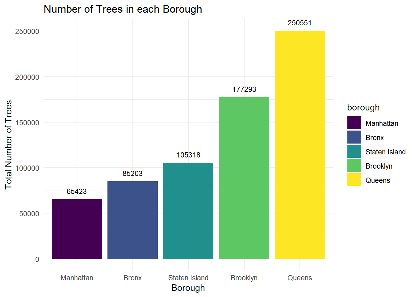
Trees in Each Borough
This plot summarizes the total number of trees in each borough according to the data collected within the 2015 Street Tree Census. Queens has the largest number of trees, which is nearly 4 times the amount in Manhattan, which has the least number of trees.
pop_race_2010 = readxl::read_excel("small_data/pop_race2010_nta.xlsx", skip = 6, col_names = FALSE, na = "NA") |>
  rename(
   "borough" = "...1" ,
   "census_FIPS" = "...2",
   "nta" = "...3",
   "nta_name" = "...4",
   "total_population" = "...5",
   "white_nonhis" = "...6",
   "black_nonhis" = "...7",
   "am_ind_alaska_nonhis" = "...8",
   "asian_nonhis" = "...9",
   "hawaii_pac_isl_nonhis" = "...10",
   "other_nonhis" = "...11",
   "two_races" = "...12",
   "hispanic_any_race" = "...13"
  ) |>
  drop_na() |>
  select(- borough, -nta_name)

all_data = left_join(trees_2015, pop_race_2010, by = "nta")

number_tree =
  all_data |>
  group_by(borough) |>
  summarize(n_trees = n_distinct(tree_id)) |>
  mutate(borough = fct_reorder(borough, n_trees))

ggplot(data = number_tree, aes(x = borough, y = n_trees, fill = borough)) + geom_bar(stat = 'identity') + geom_text(aes(label = n_trees), size = 3, vjust = -1) +
  labs(
    title = "Number of Trees in each Borough",
    x = "Borough",
    y = "Total Number of Trees"
  )
Manhattan
Now looking at the Manhattan borough, the plot below shows the breakdown of number of trees per NTA and the total population per 10000 people. By looking at these values side-by-side, it is notable that the Upper West Side is the only NTA that has a human population (per 10000) that surpassed the number of trees. It also has the largest number of trees. The data used to generate this plot is from merging the 2015 Street Tree Census and the 2010 US Census Population data sets.
mhtn_number_tree =
  all_data |>
  filter(borough == "Manhattan") |>
  group_by(nta_name) |>
  summarize(n_trees = n_distinct(tree_id),
            n_population = (sum(total_population)/100000)) |>
  pivot_longer(
    n_trees:n_population,
    names_to = "type",
    names_prefix = "n_",
    values_to = "total"
  ) |>
   mutate(nta_name = fct_reorder(nta_name, total))


ggplot(mhtn_number_tree, aes(x = nta_name, y = total, fill = type)) + geom_bar(stat = 'identity', position = 'dodge')+ theme(axis.text.x = element_text(angle = 65, hjust=1)) +
  labs(
    title = "Number of Trees in Manhattan by NTA",
    x = "Neighborhood Tabulation Area",
    y = "Total Number of Trees"
  )
Neighborhoods
acres_raw <-
  read_excel("small_data/t_pl_p5_nta.xlsx",
             range = "A9:J203",
             col_names = c("borough", "county_code", "nta", "nta_name",
                           "total_pop_2000", "total_pop_2010", "pop_change_num",
                           "pop_change_per", "total_acres", "persons_per_acre")
             ) |>
  janitor::clean_names()

acres_sub <- acres_raw |>
  select(nta_name, total_acres)

trees_per_nta <- trees_2015 |>
  select(nta_name, nta, borough, status) |>
  filter(status == "Alive") |>
  count(nta_name, borough) |>
  rename(num_trees = n)

trees_and_acres <- left_join(trees_per_nta, acres_sub, by = "nta_name")

num_missing_nta <- sum(is.na(trees_and_acres$total_acres))

trees_per_acre_df <- trees_and_acres |>
  filter(!is.na(total_acres)) |>
  mutate(trees_per_acre = num_trees/total_acres) |>
  arrange(desc(trees_per_acre))

trees_per_acre_nta_table <- trees_per_acre_df |>
  filter(min_rank(desc(trees_per_acre)) < 11) |>
  knitr::kable(digits = 2, caption = "Top 10 NYC Neighborhoods with the Highest Number of Alive Trees per Acre")

trees_per_acre_nta_table| nta_name | borough | num_trees | total_acres | trees_per_acre |
|---|---|---|---|---|
| Upper East Side-Carnegie Hill | Manhattan | 4540 | 460.66 | 9.86 |
| Central Harlem South | Manhattan | 2581 | 331.39 | 7.79 |
| Brooklyn Heights-Cobble Hill | Brooklyn | 1718 | 235.86 | 7.28 |
| Upper West Side | Manhattan | 5723 | 791.29 | 7.23 |
| Fordham South | Bronx | 1002 | 144.63 | 6.93 |
| Windsor Terrace | Brooklyn | 2227 | 322.38 | 6.91 |
| Yorkville | Manhattan | 2133 | 319.14 | 6.68 |
| Gramercy | Manhattan | 1125 | 171.71 | 6.55 |
| Auburndale | Queens | 5119 | 785.35 | 6.52 |
| East New York (Pennsylvania Ave) | Brooklyn | 2892 | 446.05 | 6.48 |
Comments:
- Upper East Side-Carnegie Hill in Manhattan has the greatest number of alive trees per acre.
- 6 NTAs from the 2015 Tree Census were missing acreage information, so these NTAs were removed for the purposes of this table.
Highest Number of Trees
trees_total_nta_table <- trees_per_acre_df |>
  filter(min_rank(desc(num_trees)) < 11) |>
  knitr::kable(digits = 2, caption = "Top 10 NYC Neighborhoods with the Highest Total Number of Alive Trees")

trees_total_nta_table| nta_name | borough | num_trees | total_acres | trees_per_acre |
|---|---|---|---|---|
| Rossville-Woodrow | Staten Island | 8843 | 1488.90 | 5.94 |
| Forest Hills | Queens | 7330 | 1328.22 | 5.52 |
| Bayside-Bayside Hills | Queens | 9386 | 1857.24 | 5.05 |
| Great Kills | Staten Island | 10267 | 2076.96 | 4.94 |
| Whitestone | Queens | 7253 | 1584.85 | 4.58 |
| Georgetown-Marine Park-Bergen Beach-Mill Basin | Brooklyn | 7214 | 1662.88 | 4.34 |
| Annadale-Huguenot-Prince’s Bay-Eltingville | Staten Island | 12530 | 3292.86 | 3.81 |
| East New York | Brooklyn | 9175 | 2665.73 | 3.44 |
| Charleston-Richmond Valley-Tottenville | Staten Island | 7913 | 3432.93 | 2.31 |
| New Springville-Bloomfield-Travis | Staten Island | 8142 | 7083.27 | 1.15 |
Comments:
- Rossville-Woodrow in Staten Island has the greatest total number of alive trees.
- It is important to note while these neighborhoods have a high total number of alive trees, the number of alive trees per acre is low.
- 6 NTAs from the 2015 Tree Census were missing acreage information, so these NTAs were removed for the purposes of this table.
Total Trees per NTA
The map below visualizes the spatial distribution of total street trees per neighborhood tabulation area (NTA). The neighborhoods that appear to have the lowest number of street trees are lower Manhattan and the North Bronx. The neighborhoods that appear to be in the highest band of tree counts, ranging from over 5000 to over 12000, are in southern Staten Island, Southeast Brooklyn, and across Queens.
nyc_nta = st_read("small_data/geo_export_e924b274-8b6e-427d-87c0-92bfde8ce30a.shp",
                  quiet = TRUE)

nta_dbh_summarized = trees_2015 |>
  drop_na(tree_dbh) |>
  group_by(nta) |>
  summarize(
    trees_per_nta = n(),
    avg_dbh = mean(tree_dbh))


nta_dbh_spatial = merge(nyc_nta, nta_dbh_summarized,
                        by.x = "ntacode",
                        by.y = "nta")

tm_shape(nta_dbh_spatial) +
  tm_polygons(col = "trees_per_nta",
              style = "quantile",
              n = 5,
              palette = "Greens",
              border.col = "black",
              title = "Number of Trees per NTA") +
  tm_layout(main.title = "Total Tree Count Across NYC Neighborhoods", main.title.size = 1,
            frame = FALSE) +
  tm_legend(legend.position = c("left","center"),
            legend.text.size = 0.52)
It is also important to consider that NTAs do not have standardized area, and some NTAs are dramatically larger than others and not all area is equally accommodating to planting street trees.To better understand tree density, we calculated a unit of trees per acre so that this value could be averaged across neighborhoods and account for area differences across NYC boroughs.
Tree Species
Tree Species Distribution
top_trees_nyc <- trees_2015 %>%
  drop_na(spc_common) %>%
  group_by(spc_common) %>%
  count(spc_common) %>%
  arrange(desc(n)) %>%
  head(n = 10) %>%
  pull(spc_common)

 trees_2015 %>%
    drop_na(spc_common, borough) %>%
    group_by(spc_common, borough) %>%
    count(spc_common) %>%
    filter(spc_common %in% top_trees_nyc) %>%
    pivot_wider(names_from = borough, values_from = n) %>%
    mutate(`All Boroughs Average` = mean(Bronx:`Staten Island`)) %>%
    select(spc_common, `All Boroughs Average`, everything()) %>%
    pivot_longer(cols = `All Boroughs Average`:`Staten Island`) %>%
    ggplot(aes(x = reorder(spc_common, value), y = value, fill = spc_common)) +
    geom_bar(stat = "identity") +
    facet_wrap(~ name) +
    theme(axis.text.x = element_text(angle = 45, hjust = 1)) +
    labs(x = "Tree Species",
         y = "Number of Trees",
         fill = "Tree Species",
         title = "Top Ten Trees Overall and in Each NYC Borough")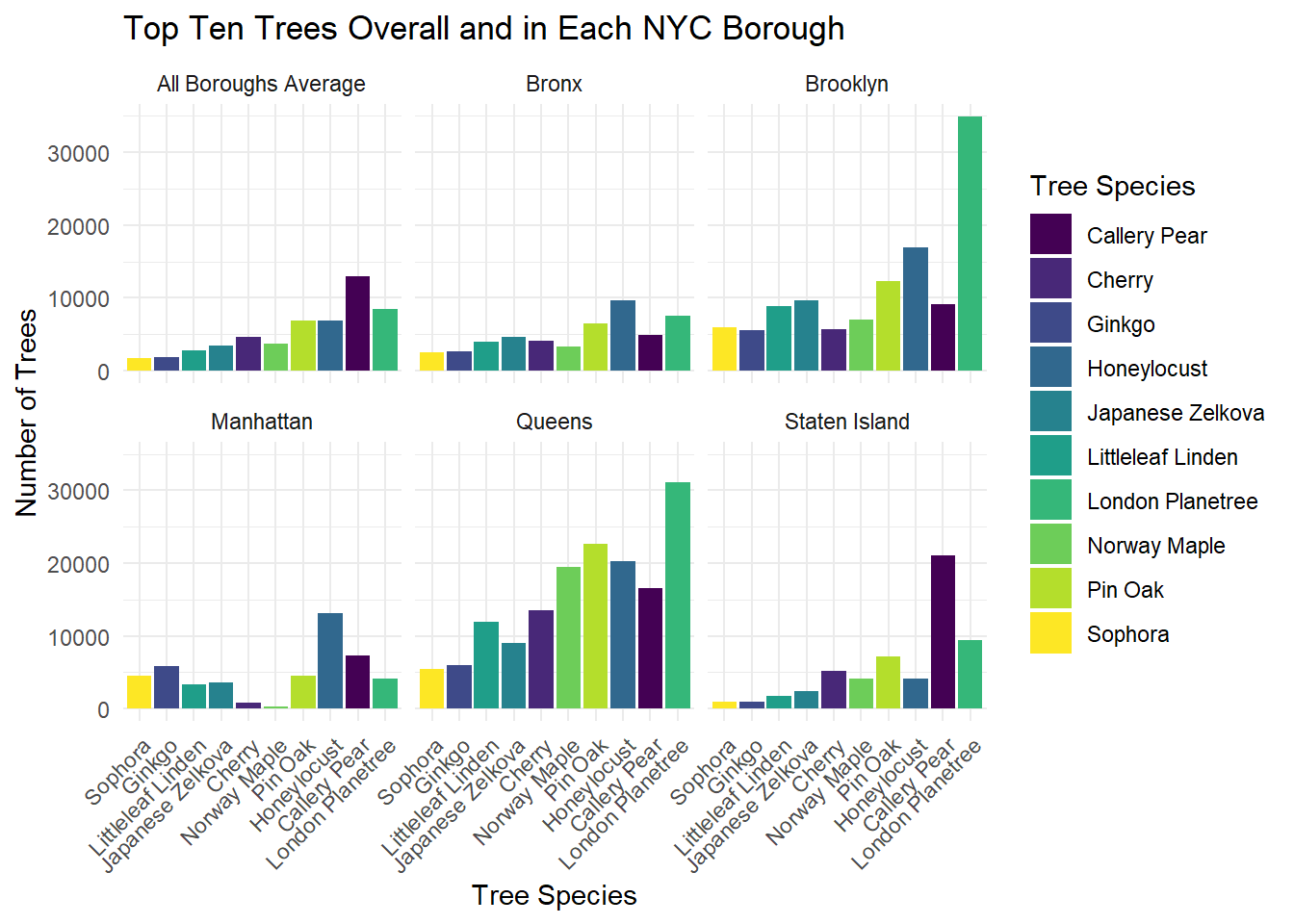
Comments:
- The most common tree in NYC overall is the Callery Pear.
- The Callery Pear is also the most common tree in Manhattan and Staten Island.
- The most common tree species in both Brooklyn and Queens is the London Planetree, and the Honeylocust is the most common tree in the Bronx.
Top Tree Species in Each Borough
trees_2015 %>%
  drop_na() %>%
  group_by(borough, spc_common) %>%
  count() %>%
  arrange(borough, desc(n)) %>%
  group_by(borough) %>%
  slice_max(n = 10, order_by = n) %>%
  select(-n) %>%
  group_by(borough) %>%
  mutate(row_num = row_number()) %>%
  pivot_wider(names_from = borough, values_from = spc_common) %>%
  unnest(cols = c(Bronx, Brooklyn, Manhattan, Queens, `Staten Island`)) %>%
  select(row_num, everything()) %>%
knitr::kable(caption = "Top 10 Tree Species in Each Borough")| row_num | Bronx | Brooklyn | Manhattan | Queens | Staten Island |
|---|---|---|---|---|---|
| 1 | Honeylocust | London Planetree | Honeylocust | London Planetree | Callery Pear |
| 2 | London Planetree | Honeylocust | Callery Pear | Pin Oak | London Planetree |
| 3 | Pin Oak | Pin Oak | Ginkgo | Honeylocust | Red Maple |
| 4 | Callery Pear | Japanese Zelkova | Pin Oak | Norway Maple | Pin Oak |
| 5 | Japanese Zelkova | Callery Pear | Sophora | Callery Pear | Cherry |
| 6 | Cherry | Littleleaf Linden | London Planetree | Cherry | Sweetgum |
| 7 | Littleleaf Linden | Norway Maple | Japanese Zelkova | Littleleaf Linden | Honeylocust |
| 8 | Norway Maple | Sophora | Littleleaf Linden | Japanese Zelkova | Norway Maple |
| 9 | Ginkgo | Cherry | American Elm | Green Ash | Silver Maple |
| 10 | Sophora | Ginkgo | American Linden | Silver Maple | Maple |
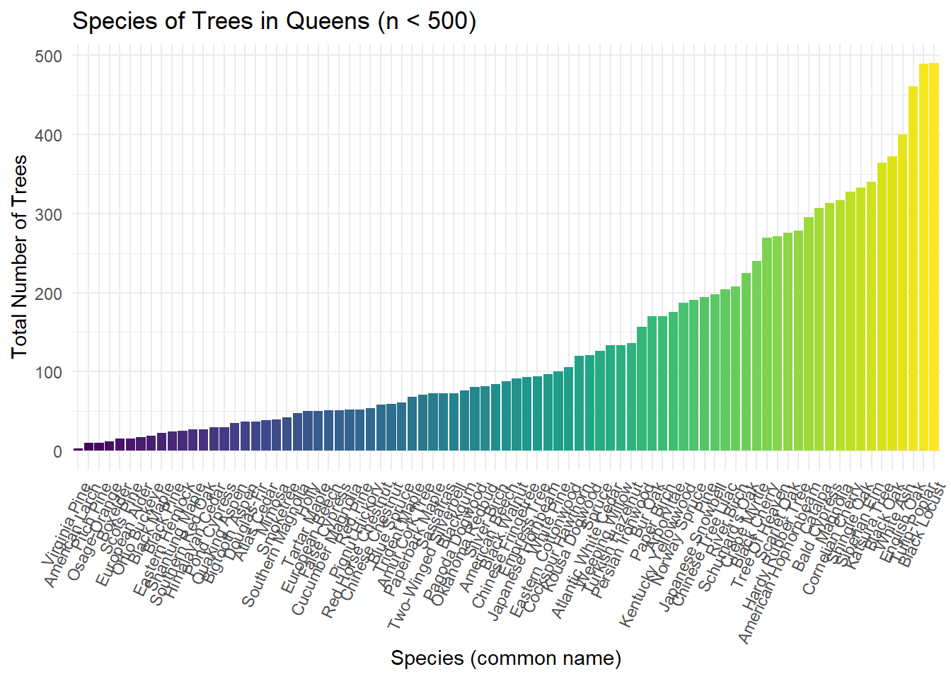
Top Species in Queens
After discovering that Queens has the greatest number of trees, a closer look was taken to evaluate which species are most prevalent. Due to the vast number of species populating Queens, the below visualization represents the counts of each species with counts up to 500 and thus showing which species are most rare.
queens_rare_trees =
  all_data |>
  filter(borough == "Queens") |>
  count(spc_common) |>
  filter(n < 500) |>
  mutate(spc_common = fct_reorder(spc_common, n))

ggplot(data = queens_rare_trees, aes(x = spc_common, y = n, fill = spc_common)) + geom_bar(stat = 'identity') + theme(legend.position = "none", axis.text.x = element_text(angle = 65, hjust=1)) +
  labs(
    title = "Species of Trees in Queens (n < 500)",
    x = "Species (common name)",
    y = "Total Number of Trees"
  )
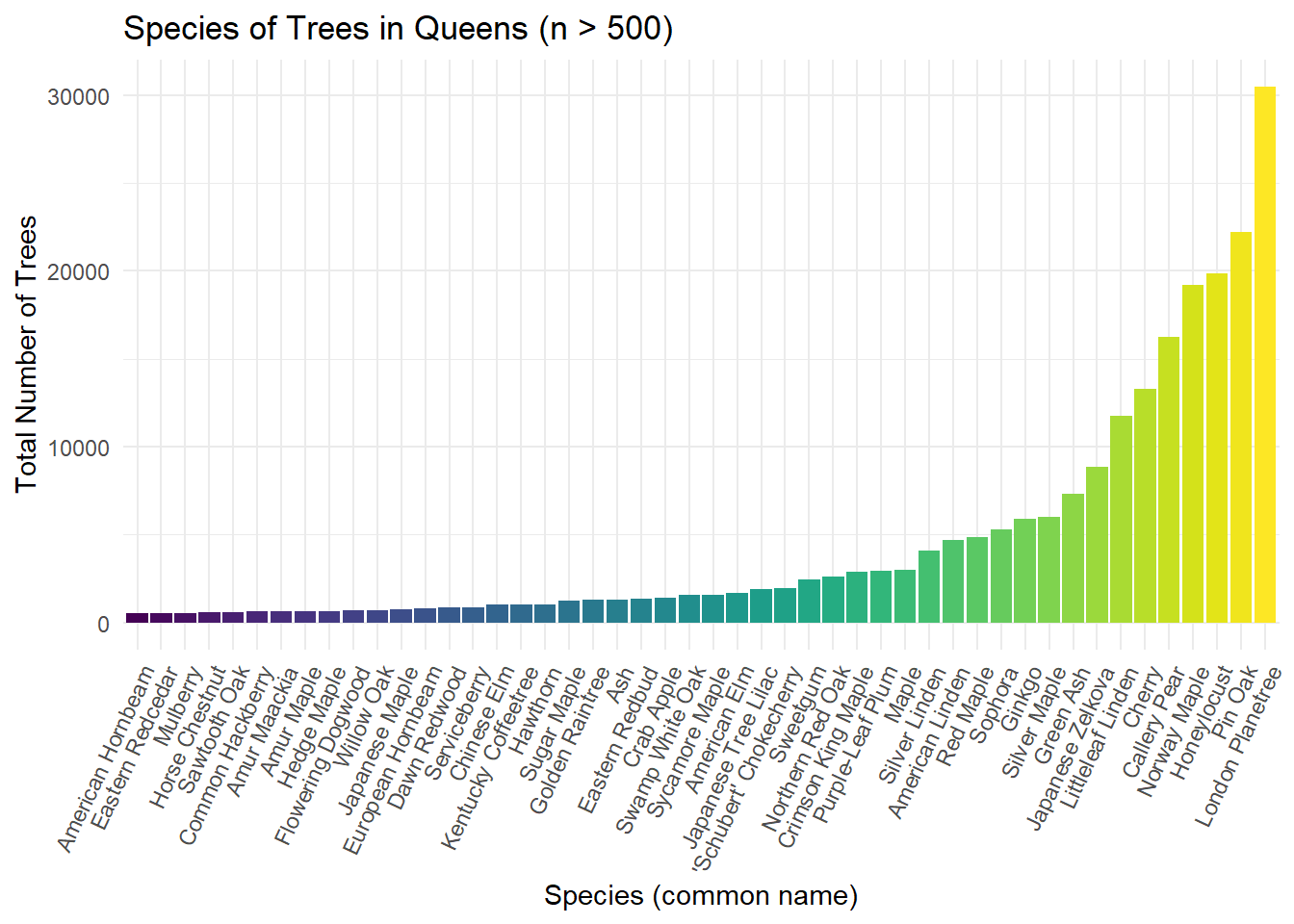
This plot is a continuation of the trends analyzed in the previous visualization. Instead of the counts of each species being less than 500, this plot shows the counts of each species with a count over 500.
queens_prev_trees =
  all_data |>
  drop_na() |>
  filter(borough == "Queens") |>
  count(spc_common) |>
  filter(n > 500) |>
  mutate(spc_common = fct_reorder(spc_common, n))

ggplot(data = queens_prev_trees, aes(x = spc_common, y = n, fill = spc_common)) + geom_bar(stat = 'identity') + theme(legend.position = "none", axis.text.x = element_text(angle = 65, hjust=1)) +
  labs(
    title = "Species of Trees in Queens (n > 500)",
    x = "Species (common name)",
    y = "Total Number of Trees"
  )
Tree DBH
Tree DBH Defined
Understanding DBH broadly:
- DBH, or diameter at breast height, is a standardized measurement of tree growth that is used by foresters as a baseline unit for understanding tree age, size, and total overall biomass. Depending on the ecological characteristics of a tree species, DBH measurements can be used to calculate estimates of above ground biomass (wood and branch cover) and below ground biomass, as well as carbon storage. With the limited information this 2015 street survey provides about DBH and tree species, we will primarily be using DBH as a proxy for the size, age, and maturity of trees across NYC neighborhoods.
- Roughly, a lower average DBH represents a greater distribution of smaller and younger trees than a higher average DBH, which has a greater number of very large, mature trees. The estimation of tree age by DBH varies widely by species, due to the differential growth factors of each tree species. Available literature and online tree calculators show that across species, a DBH of around 6 inches can range from 10 - 25 years of tree growth, while a DBH of around 14 - 15 inches ranges from 35 - 60 years of tree growth. It is likely that a tree over 40 - 50 inches has seen close to or over a century of growth.
Links to learn more:
Neighborhoods with Highest Average DBH
trees_dbh = trees_2015 |>
  drop_na(tree_dbh) |>
  group_by(borough, nta_name) |>
  summarize(
    n_trees = n(),
    avg_dbh = mean(tree_dbh)) |>
  arrange(desc(avg_dbh))

trees_dbh |>
  ungroup() |>
  filter(n_trees > 100) |>
  filter(min_rank(desc(avg_dbh)) < 11) |>
knitr::kable(digits = 2, caption= "Top 10 Neighborhoods with the Highest Average DBH (inches) Across Local Street Trees")| borough | nta_name | n_trees | avg_dbh |
|---|---|---|---|
| Queens | Kew Gardens | 2024 | 15.56 |
| Queens | Woodhaven | 4254 | 15.41 |
| Brooklyn | Flatlands | 5589 | 15.40 |
| Staten Island | New Dorp-Midland Beach | 5452 | 15.24 |
| Brooklyn | East Flatbush-Farragut | 3008 | 15.01 |
| Brooklyn | Georgetown-Marine Park-Bergen Beach-Mill Basin | 7442 | 15.01 |
| Queens | South Ozone Park | 7321 | 14.97 |
| Queens | Jamaica Estates-Holliswood | 4254 | 14.73 |
| Queens | Oakland Gardens | 6059 | 14.73 |
| Queens | Auburndale | 5332 | 14.59 |
Comments:
- Small NTA regions that had high average DBH but low tree counts of less than 100 were filtered out of this table.
- Averages around 15 inches for all 10 neighborhoods, with multiple thousands of trees within their sample size.
- 6/10 highest in Queens, no representation of Manhattan or Bronx.
Distribution of DBH in Each Borough
borough_dbh = trees_2015 |>
  drop_na(tree_dbh) |>
  group_by(borough) |>
  mutate(borough_dbh = mean(tree_dbh))

borough_dbh |>
  filter(tree_dbh < 101) |>
  plot_ly(y = ~tree_dbh, color = ~borough, type = "box", colors = "viridis") |>
  layout(title = "Distribution of DBH in Each Borough",
         xaxis = list(title = 'Borough'),
         yaxis = list(title = 'Measured DBH (inches)'),
        showlegend = FALSE)
Comments:
- All boroughs had outlier trees with DBH nearing 90-100 inches. Only 70 trees in the over 600,000 surveyed sample had a DBH over 100 inches and were excluded for better visual clarity.
- Bronx has the lowest median tree DBH, but Manhattan has the narrowest interquartile arrange around low DBH’s of 4 - 11 inches.
- Brooklyn and Queens have the highest interquartile range of DBH - with Q1 being 18 inches for both - highest amount of older growth trees.
borough_dbh |>
  filter(tree_dbh < 50) |>
  ggplot(aes(x = tree_dbh, fill = borough)) +
  geom_density() + facet_grid(borough ~ .) +
  scale_x_continuous(breaks = scales::pretty_breaks(12)) +
  labs(
    title = "Density Plot of All Measured Tree Diameters Below 50 inches",
    x = "Measured DBH (Inches)",
    y = "Density"
  )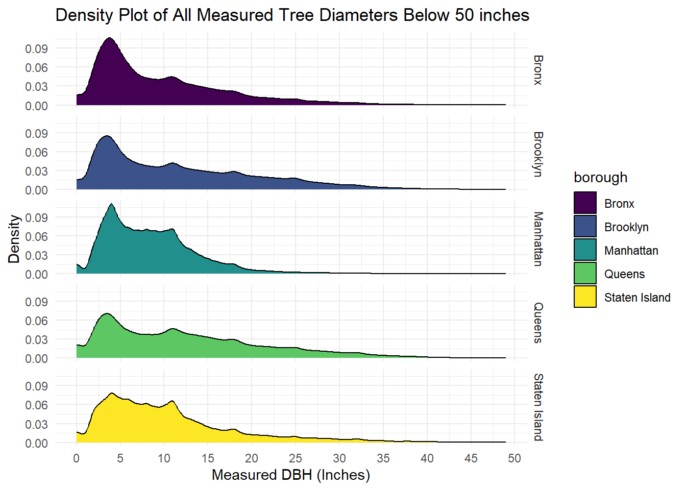
Comments:
- Young Adult trees with DBH between 3 - 7 inches most common across all boroughs.
- All tree DBH distributions are right skewed across Boroughs.
- Queens and Brooklyn have wider tails accounting for trees with DBH over 20 inches.
- Manhattan and Bronx have peaks where about 10% of all trees are less than 5 inches in DBH, these peaks are lower around 7 - 8% for Queens and Brooklyn respectively.
- Staten Island closest to bimodal distribution.
Tree DBH Mapped
tm_shape(nta_dbh_spatial) +
  tm_polygons(col = "avg_dbh",
              style = "quantile",
              n = 5,
              palette = "YlGn",
              border.col = "black",
              title = "Mean Tree DBH (Inches)") +
  tm_layout(main.title = "Average Tree DBH Across NYC Neighborhoods",
            main.title.size = 1,
            frame = FALSE) +
  tm_legend(legend.position = c("left","center"),
            legend.text.size = 0.52)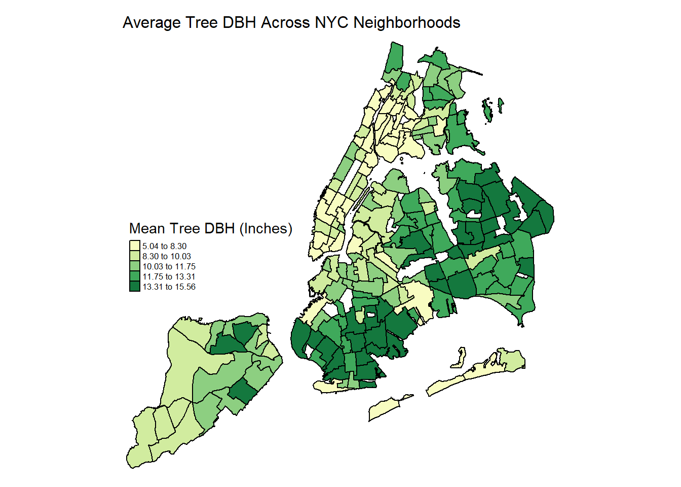
Comments:
- Highest DBH clusters between 13 and 15 inches are in easternmost Queens and South Brooklyn, some of the most residential and spacious neighborhoods of the city. Suggests these neighborhoods have the largest percentage of significantly older trees that have been growing for decades.
- Lowest DBH neighborhoods across downtown Manhattan and the Bronx - youngest and smallest trees. May have more routine plantings of young trees - and also limited curb space that stunts growth.
Tree Health Status
Below are some visualizations of all 5 boroughs of New York by Zip Code, colored by tree health. This data was collected from the 2015 Street Tree Census. The decision to use Zip Codes for these maps was made due to the availability of a shape file of New York with lines to separate by Zip Code.
NYC Overall
zip_nyc = st_read("small_data/MODZCTA_2010.shp",
                  quiet = TRUE)

trees_df =
  trees_2015 |>
  drop_na() |>
  group_by(postcode, borough, health) |>
  summarize(
    n_trees = n())

trees_zip =
  merge(zip_nyc, trees_df,
                        by.x = "MODZCTA",
                        by.y = "postcode") |>
  janitor::clean_names()

trees_zip |>
  tm_shape() +
  tm_polygons(col = "health",
              style = "equal",
              n = 3,
              palette = "viridis",
              border.col = "black",
              title = "Tree Health Status")+
  tm_layout(main.title = "Tree Heath by Zip Codes in NYC",
            main.title.size = 1,
            frame = FALSE) +
  tm_legend(legend.position = c("left","center"),
            legend.text.size = 0.52)
Health Status By Borough
The following 5 visualizations are closer visualizations of tree health status in each borough.
Manhattan
trees_zip |>
  filter(borough == "Manhattan") |>
  tm_shape() +
  tm_polygons(col = "health",
              style = "equal",
              n = 3,
              palette = "viridis",
              border.col = "black",
              title = "Tree Health Status")+
  tm_layout(main.title = "Tree Heath by Zip Codes
            in Manhattan",
            main.title.size = 1,
            frame = FALSE) +
  tm_legend(legend.text.size = 0.52)
Brooklyn
trees_zip |>
  drop_na() |>
  filter(borough == "Brooklyn") |>
  tm_shape() +
  tm_polygons(col = "health",
              style = "equal",
              n = 3,
              palette = "viridis",
              border.col = "black",
              title = "Tree Health Status")+
  tm_layout(main.title = "Tree Heath by Zip Codes in Brooklyn",
             main.title.size = 1,
            frame = FALSE) +
  tm_legend(legend.text.size = 0.52)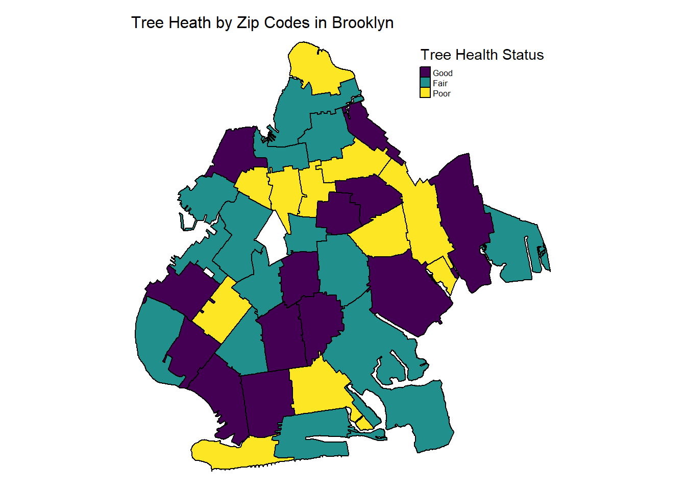
Queens
trees_zip |>
  drop_na() |>
  filter(borough == "Queens") |>
  tm_shape() +
  tm_polygons(col = "health",
              style = "equal",
              n = 3,
              palette = "viridis",
              border.col = "black",
              title = "Tree Health Status")+
  tm_layout(main.title = "Tree Heath by Zip Codes in Queens",
             main.title.size = 1,
            frame = FALSE) +
  tm_legend(legend.text.size = 0.52)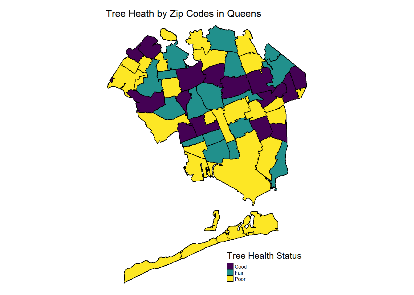
The Bronx
trees_zip |>
  drop_na() |>
  filter(borough == "Bronx") |>
  tm_shape() +
  tm_polygons(col = "health",
              style = "equal",
              n = 3,
              palette = "viridis",
              border.col = "black",
              title = "Tree Health Status")+
  tm_layout(main.title = "Tree Heath by Zip Codes in Bronx",
             main.title.size = 1,
            frame = FALSE) +
  tm_legend(legend.text.size = 0.52)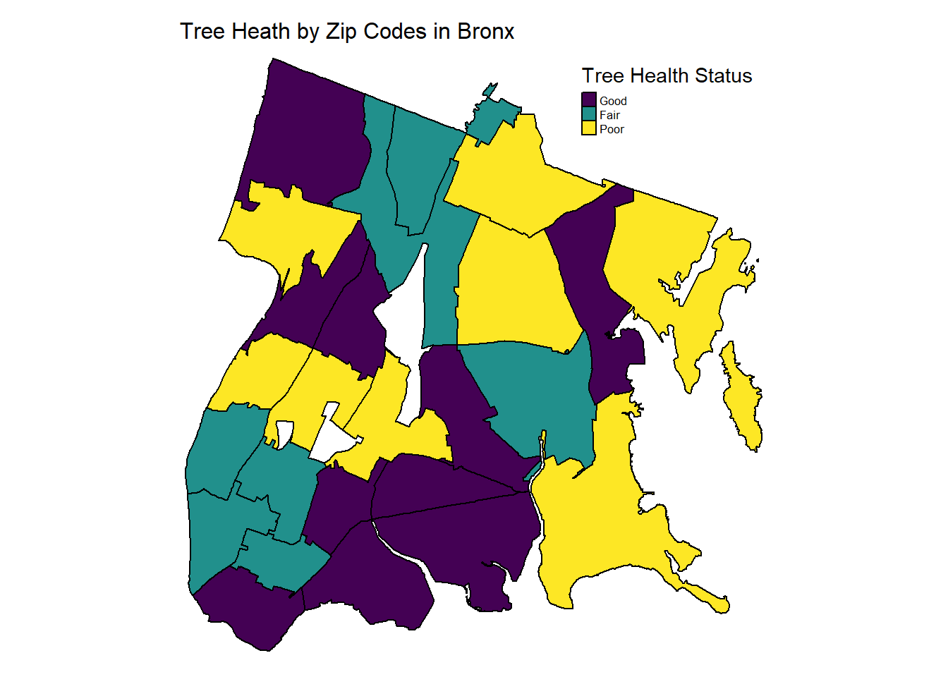
Staten Island
trees_zip |>
  drop_na() |>
  filter(borough == "Staten Island") |>
  tm_shape() +
  tm_polygons(col = "health",
              style = "equal",
              n = 3,
              palette = "viridis",
              border.col = "black",
              title = "Tree Health Status")+
  tm_layout(main.title = "Tree Heath by Zip Codes in Staten Island",
             main.title.size = 1,
            frame = FALSE) +
  tm_legend(legend.text.size = 0.52)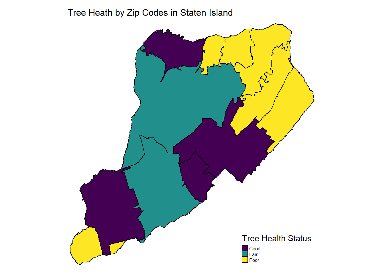
Washington Heights
Tree Health Map
The map below is the tree health across Washington Heights by Zip Codes.
trees_df_nta =
  trees_2015 |>
  drop_na() |>
  group_by(nta_name, postcode, health) |>
  summarize(
    n_trees = n())

trees_nta =
  merge(zip_nyc, trees_df_nta,
                        by.x = "MODZCTA",
                        by.y = "postcode") |>
  janitor::clean_names()

trees_nta |>
  drop_na() |>
  filter(
         nta_name %in% c("Washington Heights South", "Washington Heights North")) |>
  tm_shape() +
  tm_polygons(col = "health",
              style = "equal",
              n = 3,
              palette = "viridis",
              border.col = "black",
              title = "Tree Health Status")+
  tm_layout(main.title = "Tree Heath by Zip Codes
            in Washington Heights",
             main.title.size = 1,
            frame = FALSE) +
  tm_legend(legend.text.size = 0.52)
Interactive Tree Scatter Plot
This plot is an interactive scatter plot of every tree included in Washington Heights included in the 2015 Street Tree Census data set. The colors indicate the health of the tree and when hovering over a certain point, the latitude, longitude, and species are shown.
trees_2015 |>
  drop_na() |>
  filter(
         nta_name %in% c("Washington Heights South", "Washington Heights North")) |>
   plot_ly(color = ~health, colors = "viridis") |>
  add_trace(
    type = "scattermapbox",
    mode = "markers",
    lon = ~longitude,
    lat = ~latitude,
    marker = list(size = 5),
    text = ~spc_common,
    below = "markers"
  ) |>
  layout(
    title = "Tree Health in Washington Heights",
    mapbox = list(
      style = "carto-positron",
      center = list(lon = -73.94, lat = 40.84),
      zoom = 12
    ),
    showlegend = T
  )